
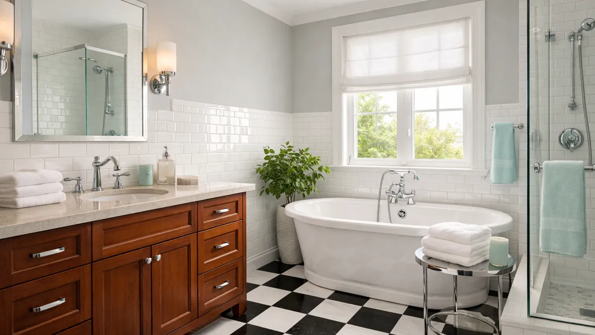
Choosing bathroom colors can feel tricky because the room has to do more than look nice. It needs to feel clean in the morning, calm at night, and easy to live with every day. That is why classic bathroom color schemes are useful — they give you a reliable starting point while still leaving room to shape the mood of the space.
I always think a good bathroom palette should work with the fixed pieces first: tile, flooring, vanity, tub, mirrors, and fixtures. Once those pieces feel connected, towels, flowers, plants, and small accessories are easier to choose.
These bathroom color schemes that never go out of style are built around combinations with real staying power, moving from crisp black and white to warm mocha tones, soft marble grays, and brighter pairings.
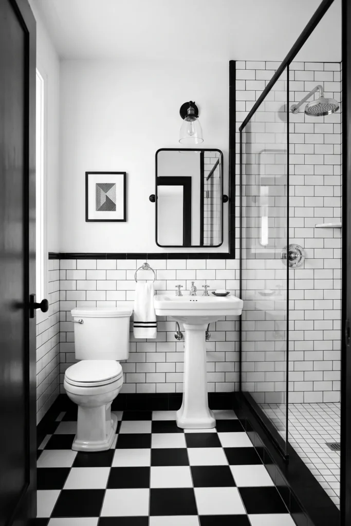
Black and White Bathroom Color Scheme with Checkerboard Tile
A black-and-white bathroom always feels grounded because the contrast is simple and clear. Checkerboard floor tiles are especially good for this look because they give the room a pattern without needing a lot of extra decoration. Even in a small bathroom, that classic floor can make the whole space feel more intentional.
Chrome fixtures work naturally with black and white because they keep the palette crisp. Silver-framed mirrors add the same clean shine, and bold geometric shapes can echo the checkerboard without making the room too busy. The key is to let black and white lead the design.
For a practical touch, use towels or small accessories in bold red or yellow. I would keep those pieces easy to swap, like hand towels, a tray, or a soap dispenser. That way, the bathroom keeps its perpetual base, but you can still add energy when you want it.
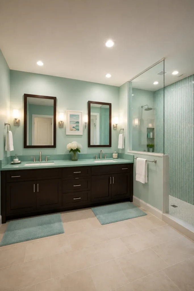
Aqua, Chocolate, and White Bathroom Color Scheme with a Deep Vanity
Aqua, chocolate, and white can make a bathroom feel fresh without becoming cold. The aqua brings a watery, clean feeling, while a deep chocolate vanity gives the room weight. White keeps everything from feeling too heavy, especially around towels, walls, or simple countertop details.
This combination works best when the materials feel balanced. Beige flooring and natural wood help soften the contrast between the cool aqua and the dark vanity, while aqua and white towels can repeat the scheme without leaning too far into blue-green.
Lighting matters a lot with this palette. Aqua can sometimes cast an unflattering tone when the light is too cool or poorly placed, so I would use lighting that keeps the mirror area warm and even. Place the aqua in towels or accents, and let the chocolate vanity and beige floor do the steady work.
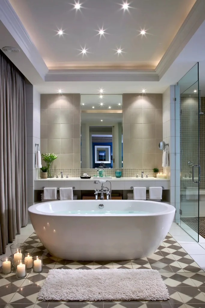
Mocha and Creamy White Bathroom Color Scheme for a Warm Look
Mocha and creamy white are good choices when you want a bathroom to feel warm instead of sharp. Rich mocha flooring gives the room a comfortable base, while creamy white keeps the space from feeling closed in. It is softer than pure white and works well with espresso-inspired shades.
This palette is especially useful when you want to spotlight particular areas. Blocks of mocha or espresso color can help define the bathtub, vanity, or a feature wall. Instead of using a pattern, the room gets interest from deeper and lighter tones sitting next to each other.
A simple way to use this scheme is to keep the largest areas creamy white, then let the mocha appear in flooring, paint sections, or the vanity area. That way, the bathroom moves easily from bright surfaces to deeper tones, and the space is comfortable around the bathtub.
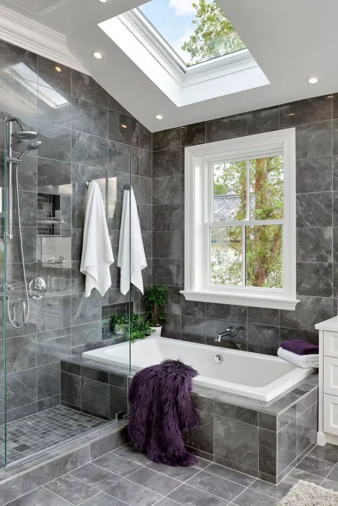
Monochromatic Gray Bathroom Color Scheme with Marble and Greenery
A monochromatic gray bathroom can feel very calm when the materials have enough texture. Carrara marble is a natural fit because it already has movement in its veining, so the room does not look flat. Quartz can also work well when you want a cleaner, more consistent surface.
The nice thing about gray is that it gives you a quiet background. Different gray tones can appear in the countertop, walls, flooring, or shower area without fighting each other, and fresh flowers or a lush, leafy potted plant can stand out beautifully.
I would avoid making every surface the exact same gray. A slightly lighter wall, a marble surface with soft veining, and a denser floor can make the room feel layered. Add greenery near the vanity or tub if there is enough light. It gives the bathroom a fresh note without changing the classic color scheme.
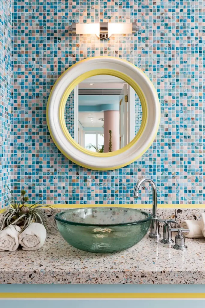
Blue and Yellow Bathroom Color Scheme with Mosaic Tile
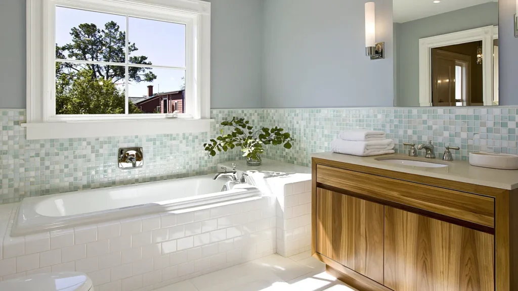
Blue and yellow can bring a bright, cheerful feeling to a bathroom, but it works best when one color clearly leads. Traditional blue mosaic tiles are a strong starting point because they give the room texture, pattern, and a natural water-inspired look, while yellow can follow as an accent.
Sky blue or ocean blue can feel calm across a larger area, especially in tile or paint. Bright yellow works better in smaller blocks because it has a lot of energy. A yellow painted section, a towel, or a few accessories can warm up the blue without making the bathroom feel too loud.
If I were using this scheme, I would let the blue mosaic tile be the main feature and keep the yellow pieces easy to change. That gives the bathroom a timeless base with just enough color to feel lively. It is a good option for anyone who wants a bathroom that feels fresh in the morning.
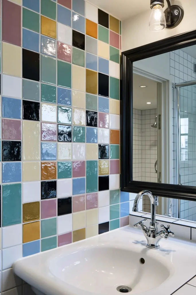
Double Complementary Bathroom Color Scheme with Bold Color Pairings
A double complementary bathroom color scheme is one of the bolder ideas, but it can still feel balanced when it is handled carefully. The idea is to use two pairs of complementary colors, such as blue and orange, and red and green. Because those colors naturally create contrast, the room needs a steady base to keep everything from feeling scattered.
Black and white elements are useful here because they give the eye a place to rest. A white wall, black trim, a simple mirror, or neutral tile can help organize the stronger colors. Without that balance, the palette can quickly feel too busy, especially in a smaller bathroom.
The most practical way to use this look is by controlled color blocks. Choose where each color appears before adding anything else. For example, one pair could appear in painted areas, while the other pair stays in towels or accessories. That keeps the bathroom colorful but still planned, which is what makes the scheme feel intentional instead of random.
Bringing the Bathroom Palette Together
The best bathroom color schemes that never go out of style usually have one thing in common: they give the room a clear foundation. Black and white feel crisp, mocha and creamy white feel warm, gray with marble feels calm, and brighter pairings like blue and yellow bring energy without needing to take over the whole room.
When choosing your own palette, I would start with the pieces that are hardest to change, like floor tile, vanity color, bathtub area, and fixtures. Then use towels, mirrors, flowers, plants, and small accessories to bring in contrast or personality.
A bathroom does not need a complicated color plan to feel finished. When the colors work with the materials already in the room, even simple choices can feel thoughtful, comfortable, and easy to live with.