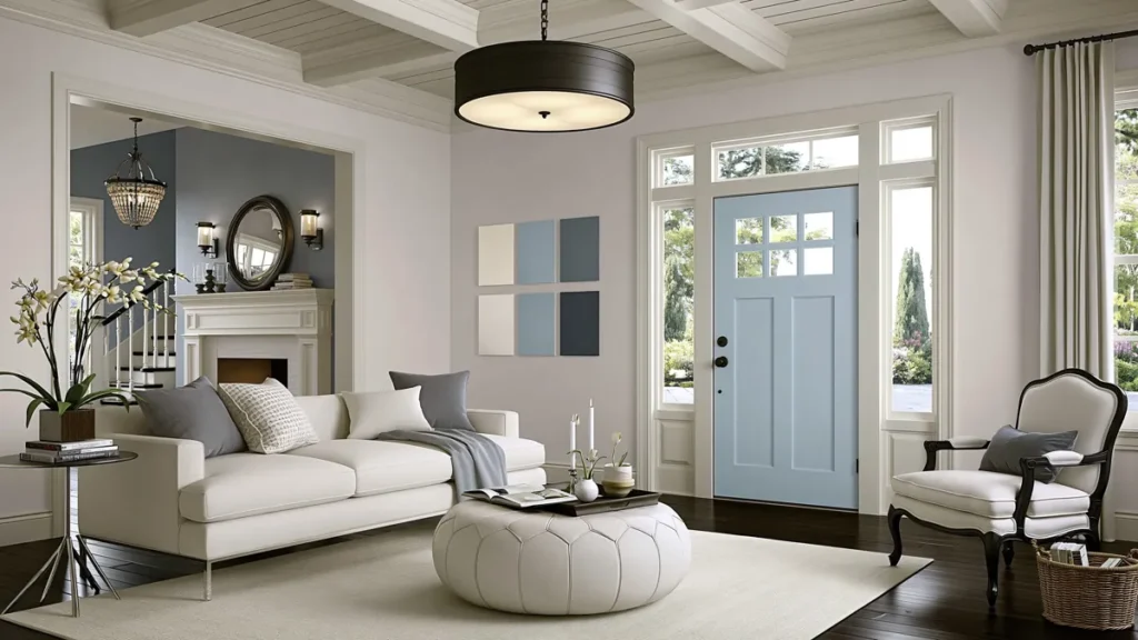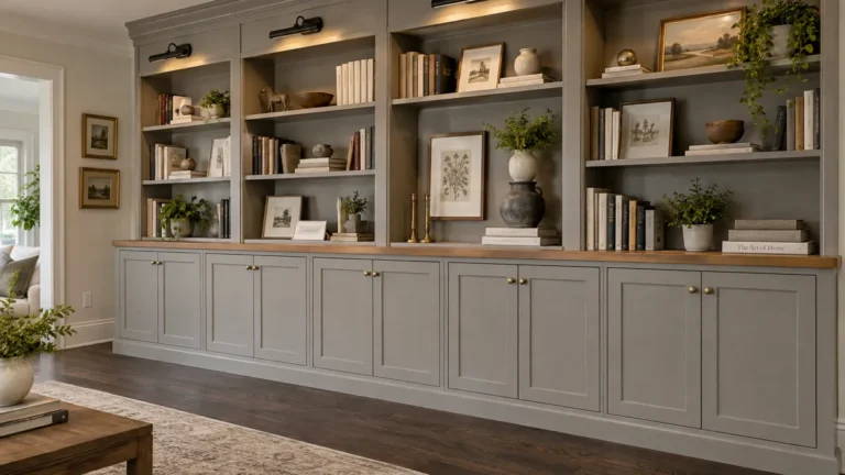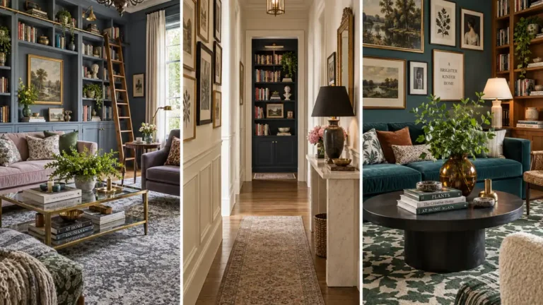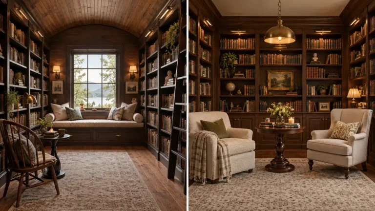

Choosing paint for one room is hard enough, but choosing colors that work across the whole house can feel even trickier. I always think a home feels more comfortable when the rooms have their own personality, but still feel connected as you move from one space to another.
That is where whole-house cohesive paint palettes can be really helpful. Instead of picking random colors room by room, you can use a soft flow of related shades that feel calm, balanced, and easy to live with.
For this palette, the ideas move through a warm living room, a gentle gray bedroom, a quiet blue bathroom, and a soft blue-gray kitchen. Each color has its own mood, but together they create a home that feels thoughtful without feeling too matched.
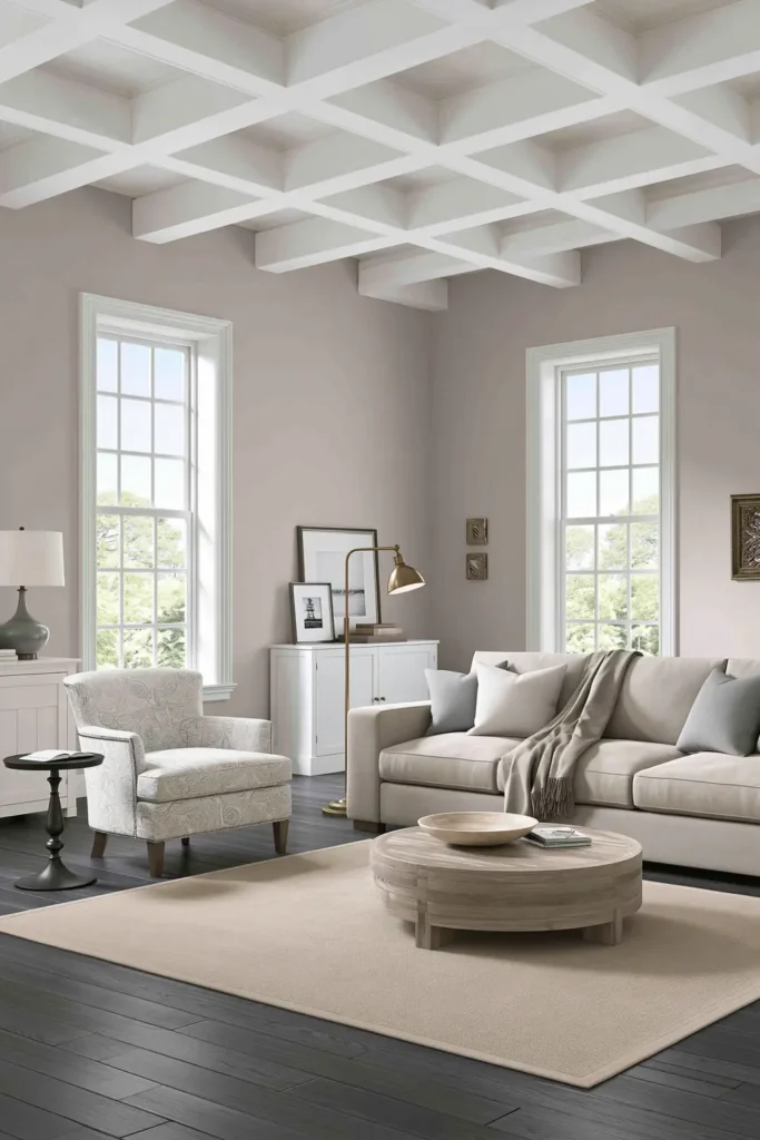
Driftscape Tan Living Room for a Soft Feminine Palette
A living room painted in Benjamin Moore Driftscape Tan can bring a soft, feminine warmth without making the space feel overly sweet. It has that gentle neutral quality that works well in a room where people gather, relax, and spend their everyday time. I like this kind of shade because it gives the walls a little presence while still staying calm enough for a main living area.
Since the source focuses on the paint itself, color becomes the main design feature here. Driftscape Tan would pair nicely with soft fabrics, warm woods, cream upholstery, or simple brass accents, if you want the room to feel a little more polished. The key is to let the wall color create the comfort instead of adding too many competing tones.
For a cohesive whole-house palette, this is a smart starting point. A living room often connects to nearby rooms, so using a warm neutral here can make the rest of the home feel grounded.
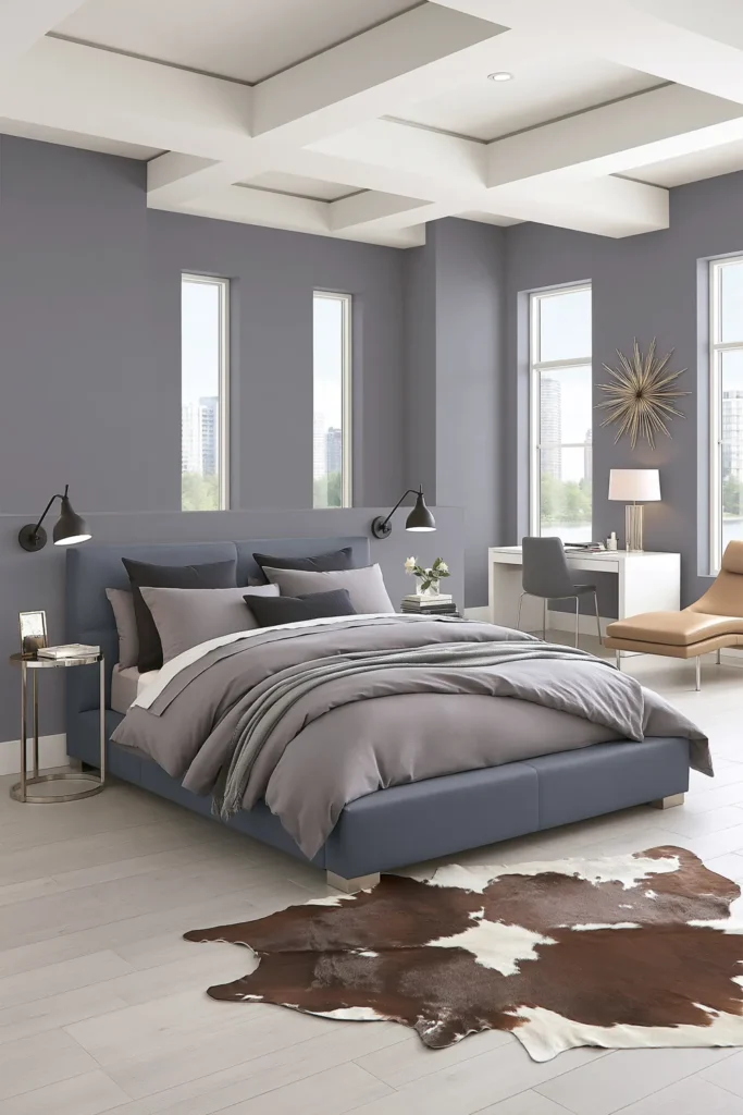
Stormy Monday Bedroom for a Gentle Gray Color Flow
Benjamin Moore Stormy Monday can work beautifully in a bedroom when you want a gray that feels restful instead of cold. Bedrooms usually benefit from quieter colors, and this shade gives the space a calm base without feeling plain. It has enough depth to make the room feel settled, but it still stays soft enough for daily living.
In a whole house palette, gray can act like a bridge between warmer and cooler rooms. If the living room has the softness of Driftscape Tan, Stormy Monday can gently shift the home toward a cooler direction without making the change feel sudden. That kind of gradual movement is what makes paint colors feel connected.
A practical way to use this shade is to keep the bedroom decor simple around it. Light bedding, muted textiles, and natural textures would let the gray walls do their job quietly. The room does not need a lot of extra color to feel finished.
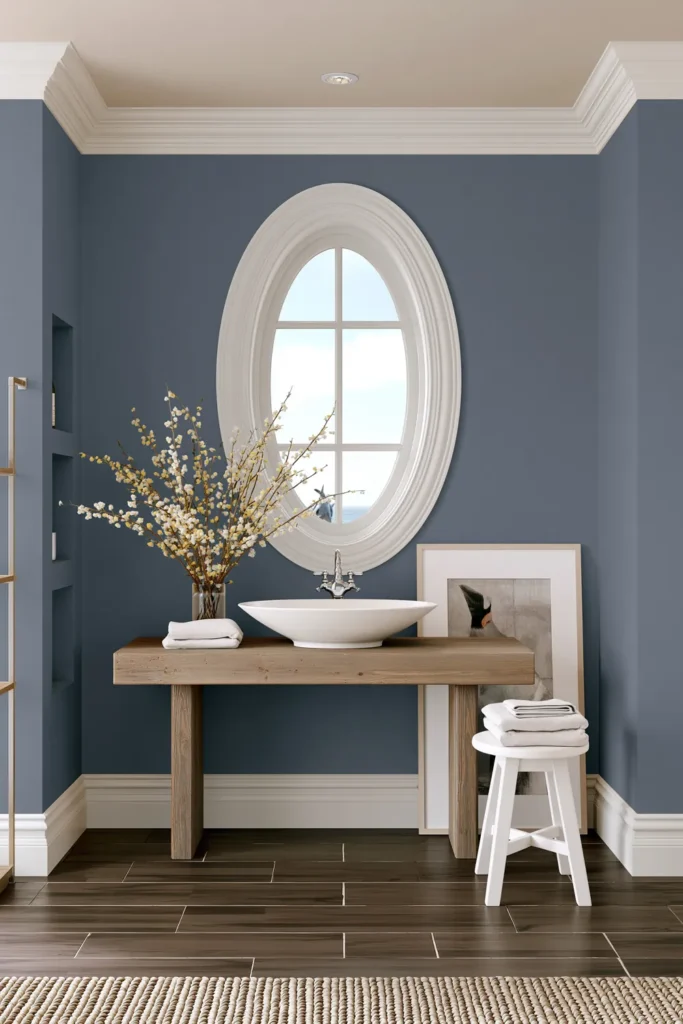
Blue Gaspe Bathroom for a Quiet Blue Paint Moment
A bathroom is a nice place to introduce a slightly stronger color, and Benjamin Moore Blue Gaspe gives that quiet blue moment without overwhelming the whole house. Since bathrooms are usually smaller and more contained, they can handle a color with more personality while still fitting into a calm palette.
Blue works especially well in a bathroom because it naturally feels clean and fresh. Blue Gaspe can give the room a soft, collected look, especially if the surrounding colors in the home are warm neutrals and gentle grays. It adds interest, but it does not feel disconnected from the rest of the palette.
For a consistent look, I would treat this bathroom color as an accent in the overall home. Keep nearby trim, tile or accessories simple so that the blue does not have to compete. This makes the bathroom feel special while still belonging to the same overall color story.
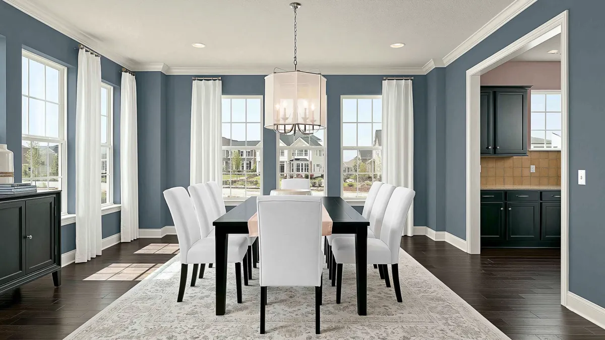
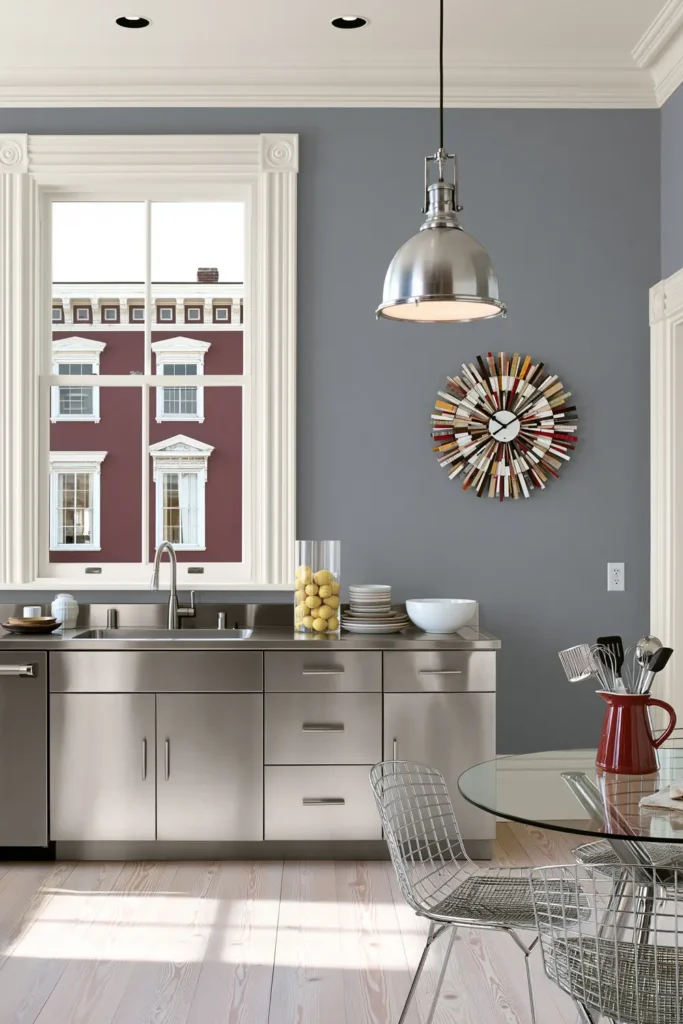
Metropolitan Kitchen for a Soft Blue-Gray Palette
Benjamin Moore Metropolitan is a lovely choice for a kitchen when you want something cooler than beige but softer than a true blue. It sits in that blue-gray family that feels clean, steady, and easy to pair with many kitchen finishes. A shade like this can make the kitchen feel calm without taking away from cabinets, counters, or hardware.
In the flow of whole-house cohesive paint palettes, Metropolitan can connect nicely with both Stormy Monday and Blue Gaspe. It carries the gray softness from the bedroom, while also expressing the blue mood from the bathroom. That connection helps the home feel planned, even though each room has its own purpose.
This kind of kitchen color works best when the rest of the finishes are allowed to breathe. Simple surfaces, natural textures, and clean lines would keep the room from feeling too busy. The paint adds quiet color, but the kitchen can still feel practical and comfortable.
Bringing the Palette Together at Home
The strongest part of this palette is the way it moves gently from warm to cool. Driftscape Tan gives the living room softness, Stormy Monday brings calm to the bedroom, Blue Gaspe adds a quiet bathroom accent, and Metropolitan ties the kitchen into the same blue-gray family.
A connected house does not need every wall to be the same color. It just needs the colors to feel like they are talking to each other. These shades create that kind of easy connection where each room has its own mood, but the whole house still feels peaceful.
When testing colors like these, I would always paint samples in the actual rooms first. Light can change everything, especially with grays and blues. Once the colors feel good in your own lighting, the palette can make the home feel more settled, more intentional, and easier to enjoy every day.