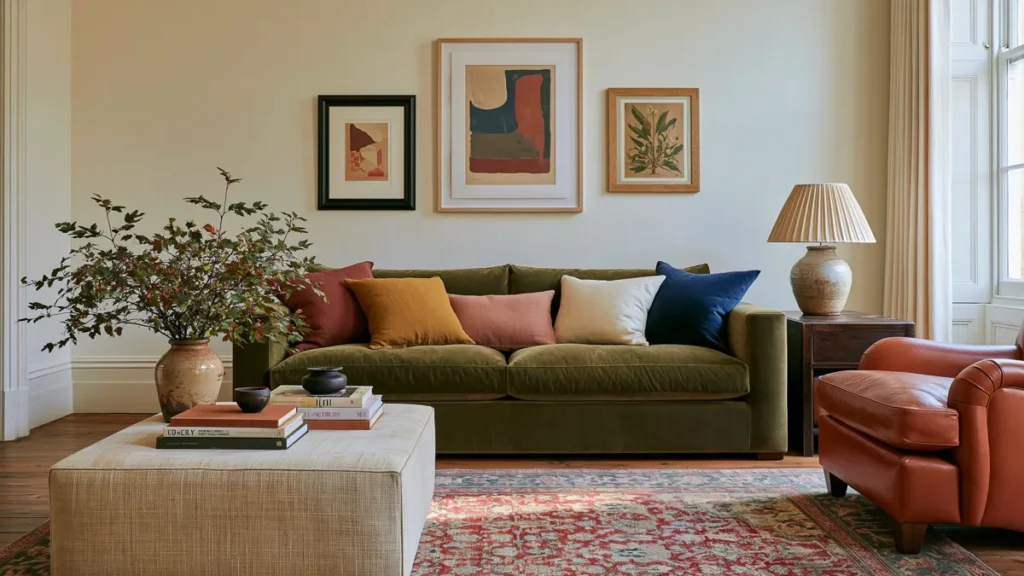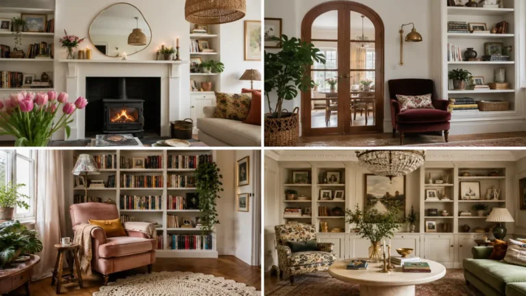

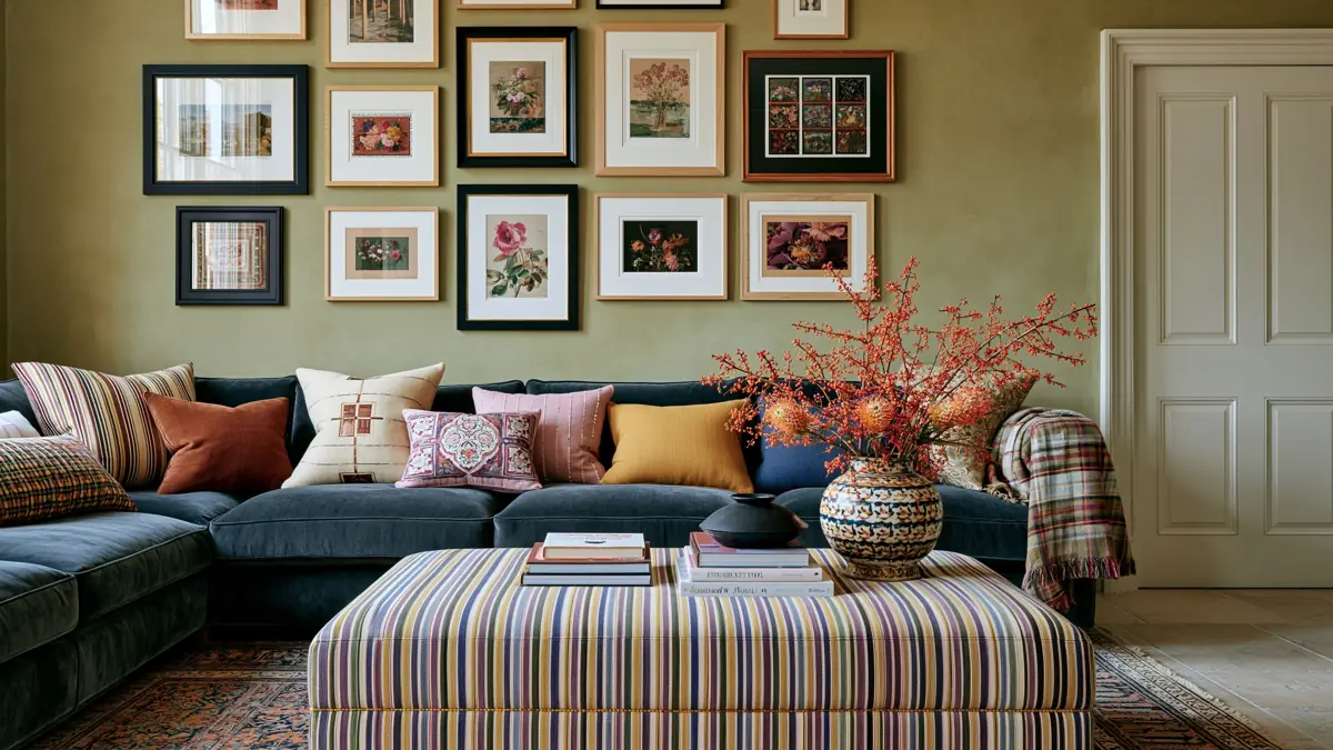
The right colors can completely change how a living room feels. A room that formerly seemed cold or unfinished can become softer, calmer, and much more inviting with a thoughtful mix of wall color, furniture, and accents.
These living room color combinations are designed to create coziness without causing the space to feel heavy. Some are light and subtle, while others use deeper, moodier shades. The best choice relies on your natural light, the character of your home, and how bold you want the room to feel.
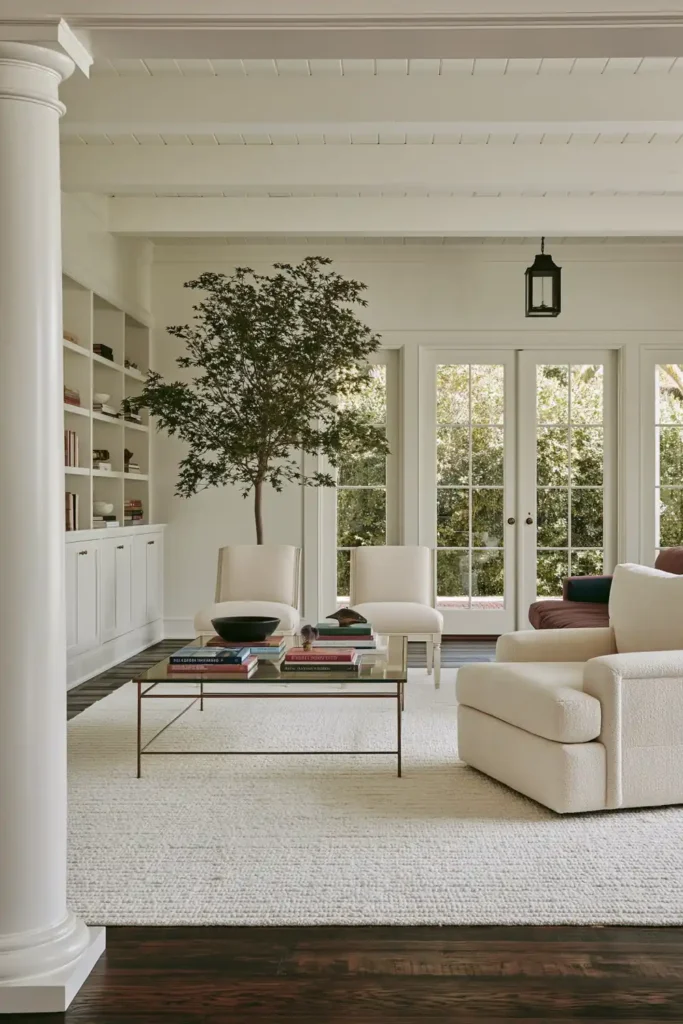
Classic White Walls for a Bright and Soft Living Room
A white living room can still feel warm when the shade is clean rather than harsh and when soft, neutral materials surround it. In a naturally bright room, pure white walls help the daylight move around the space and create an open, peaceful atmosphere.
The key is to avoid making every surface feel equally crisp. Soft upholstery, woven textiles, and gentle neutral finishes can keep the room from looking flat or clinical. Even when the furniture is simple, these subtle layers give the white backdrop more depth.
This combination works especially well in a living room that already receives plenty of natural light. The white walls allow the brightness to become part of the decor while leaving plenty of flexibility for artwork, furniture, and accessories.
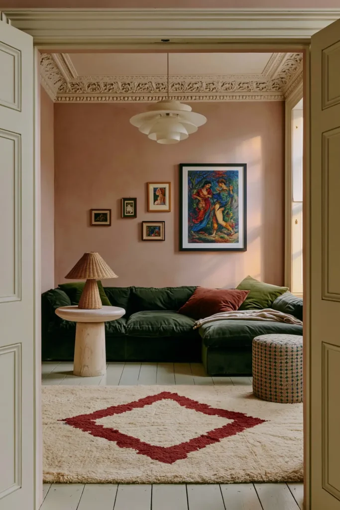
Plaster Pink Walls With Burnt Red, Orange, and Sage Accents
Soft plaster pink creates a warm backdrop without making the living room feel overly sweet. A pale, chalky pink with peach undertones can make the room feel gentle and light while still adding more personality than a standard neutral.
This color becomes especially interesting when it is paired with stronger accents. Deep burnt reds, bright oranges, turquoise, or sage green can all stand out beautifully against the subdued pink walls. The softer wall color keeps those bolder shades from becoming overwhelming.
This is one of the best living room color combinations for a warm feel when you want an eclectic room that still feels balanced. Use the stronger colors through furniture, cushions, artwork, or smaller decorative pieces so the pink remains the calming foundation.
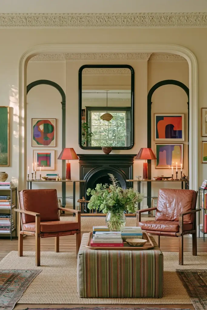
Warm Cream Walls With Colorful Furniture and Patterned Decor
Warm cream is a useful choice for a living room filled with colorful furniture, patterned accessories, and artwork. It gives the space a calm background while still feeling softer and more welcoming than bright white.
A gentle off-white with warm undertones works particularly well with scattered pieces in different colors. Soft green and blue accents can bring freshness, while patterned decor and colorful artwork add energy without competing with the walls.
Cozy textiles are important in this type of room. Rugs, cushions, throws, and upholstered pieces can help connect the different colors and make the overall scheme feel intentional. The cream walls then act as a quiet thread running through the entire space.
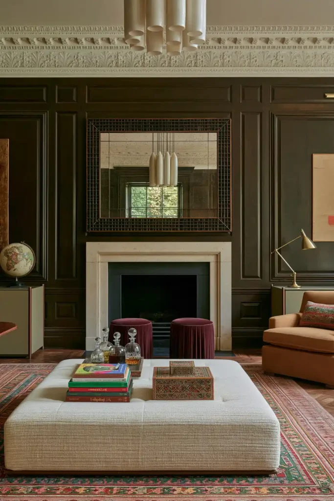
Rich Chocolate Brown Walls With Chestnut and Caramel Tones
Chocolate brown can make a living room feel sophisticated, enveloping, and deeply comfortable. Rather than treating brown as a basic neutral, this scheme builds warmth by layering several related shades, including chestnut, mahogany, caramel, and other organic shades.
A rich brown wall color creates a cocooning effect, especially in a room used for relaxing in the evening. Lighter caramel accents can prevent the scheme from feeling too dark, and deeper wood tones add richness and visual weight.
Because these colors are closely connected to natural materials, they can also make the room feel grounded. The combination works best when there is enough variation between the shades, allowing each brown tone to remain visible instead of running into one flat surface.
Warm Cream Walls With Contrasting Sage Green Woodwork
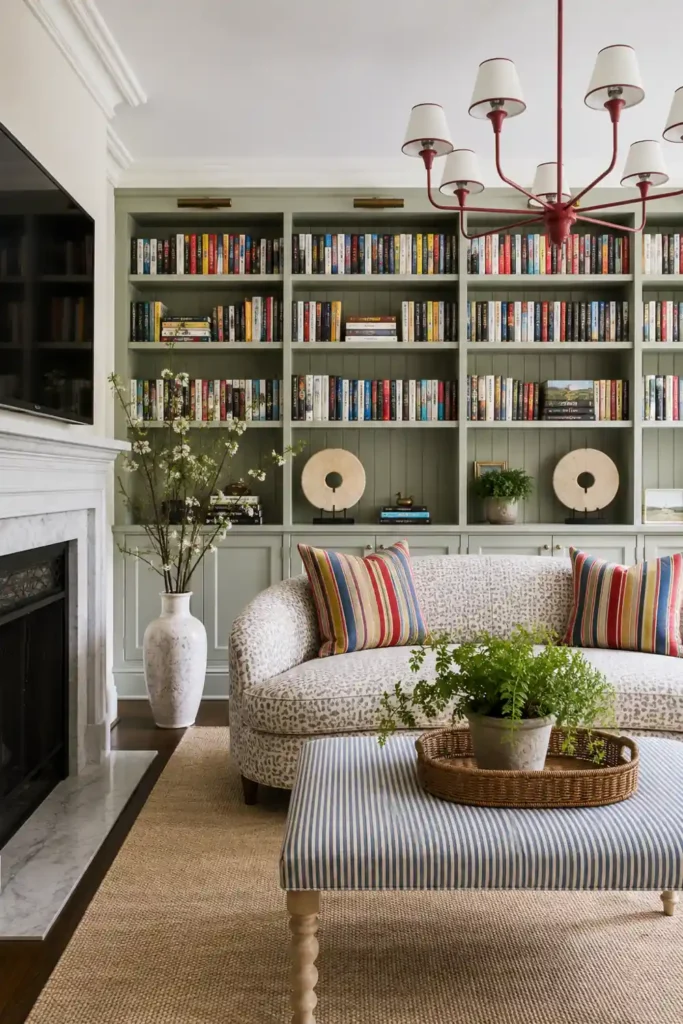
Painting built-in shelving, cabinetry, or other woodwork in sage green can add gentle contrast to a living room with warm cream walls. The combination feels calm and traditional, but the difference between the two colors gives the room more definition.
Warm cream keeps the main surfaces light and welcoming, while soft green draws attention to architectural details. This can be especially effective around a bookcase, media unit, window trim, or fitted storage that might otherwise disappear into the walls.
Small touches of another color can make the scheme feel more personal. Blue on ceiling molding or pink inside a bookcase adds a surprising layer without disturbing the relaxed mood. Keeping these accents limited helps the cream and sage remain the main color story.
Powder Blue Walls With Green and Deep Coral Accents
Dusty powder blue can make a living room feel tranquil without becoming cold. In a traditional room with vintage furnishings, the muted quality of the blue works well with aged finishes, antique details, and layered fabrics.
Green and deep coral accents add warmth and prevent the room from feeling too pale. These colors can appear through upholstery, patterned cushions, curtains, or decorative objects, creating contrast while still feeling connected to the softened blue walls.
This palette is especially useful when you want to refresh an older room without hiding its character. The powder blue brings lightness, while vintage furniture and richer accent colors preserve a sense of depth and history.
Earthy Sage Green With Dark Wood, Bouclé, and Stone
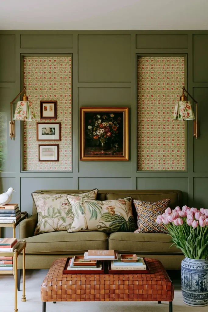
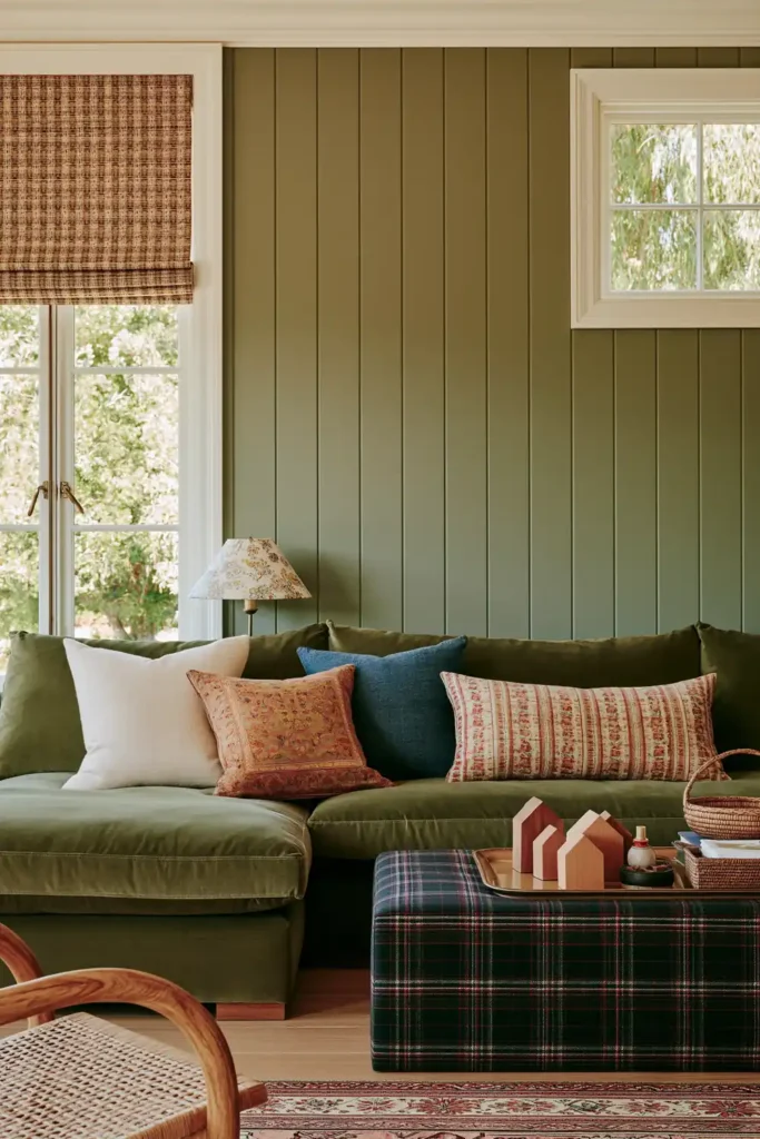
An all-green living room can feel grounded and restful when the shade has subdued gray undertones. Earthy sage or gray-green walls create a natural background, and a matching green sofa can make the space feel cohesive rather than overly coordinated.
Dark wood introduces depth and keeps the green from appearing washed out. Tactile bouclé adds softness, while marble or quartz surfaces provide a smoother, cooler contrast. Together, these textures stop a single-color scheme from feeling flat.
This combination works because the materials are as important as the paint color. The room can stay within a narrow green palette while still feeling layered through the difference between soft fabric, polished stone, and rich wood.
A Modern Organic Palette of Beige, Caramel, and Black
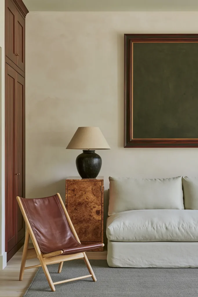
A modern organic living room often begins with sand-colored walls and layers of off-white, beige, cream, and neutral brown. These close, quiet tones create an airy background that feels warm without relying on strong color.
Natural materials give the palette its character. Wood, stone, and linen bring visible texture, while caramel tones add a slightly richer note among the paler neutrals. The result feels relaxed and carefully considered rather than plain.
Sharp black accents help define the room. A narrow frame, dark furniture detail, or simple decorative object can break up the soft palette and give the space a cleaner, more contemporary edge. Used sparingly, black makes the lighter colors feel even warmer.
Glossy White Walls With Sunny Yellow Architectural Details
Sunny yellow can bring a cheerful warmth to a traditional living room without covering every wall in a strong color. High-gloss white walls keep the room bright, while deep yellow on molding, trim, or other architectural details adds definition and energy.
The reflective finish helps light bounce around the space, which can make the room feel livelier during the day. Matching yellow-toned furniture or accessories can then connect the architectural color to the rest of the room.
This approach works best when the yellow appears in a few deliberate places rather than everywhere at once. The white backdrop keeps the scheme fresh, while the deeper yellow gives the room a clear focal point.
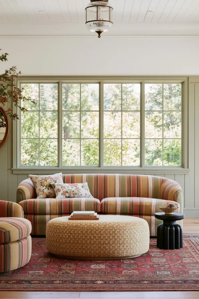
Deep Color-Drenched Walls, Woodwork, and Ceilings
Color drenching can make a small or period living room feel more complete by painting the walls, woodwork, and ceiling in the same deep shade. Deep green, burgundy, or bold blue can create an unbroken, enveloping effect that accentuates the shape of the room.
Using one color across every surface reduces visual breaks, which can make the room feel calmer even when the shade itself is dramatic. Architectural details remain visible through shadow and texture instead of through contrasting paint.
Organic textures can soften the intensity of the color. Bright blue accents can also add a sharper note against a deeper green or burgundy background, helping the room feel layered rather than overly dark.
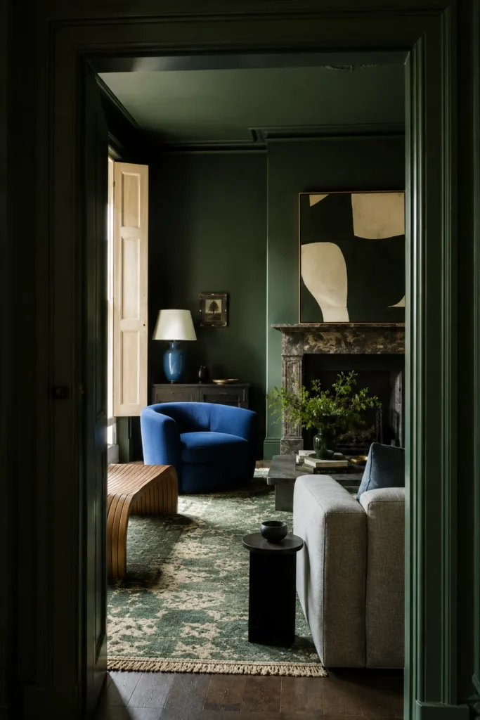
Playful Red Walls and Ceilings for an Enveloping Living Room
Painting both the walls and ceiling in a playful red creates a strong, unified appearance. Instead of stopping the color at the top of the walls, carrying it overhead makes the room feel more intentional and immersive.
This scheme suits an eclectic living room where bold color is already part of the character. The continuous red surface can feel especially warm under artificial lighting, making it a good option for a room used mainly in the evening.
Because the paint already has a powerful presence, the rest of the decor does not need to compete with it. Let furniture, artwork, and accessories sit against the red background rather than introducing too many unrelated colors.
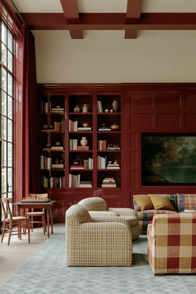
Layered Earth Tones With Botanical Prints and Natural Textures
A layered earthy palette can make a snug living room seem organic and collected. Subtle limestone walls provide a quiet base, while dark taupe creates depth through painted details or smaller accent areas.
Tonal creams and greens can appear in the furniture, especially through a patterned couch or soft furnishings. Cushions with foliage or forest scenes strengthen the natural theme without relying on plain green surfaces alone.
Cacti, leafy plants, fresh spring blooms, faux coral, and crystal geodes can bring in more varied forms and textures. Botanical prints help tie these parts together, creating a room that feels connected to nature while remaining comfortable and decorative.
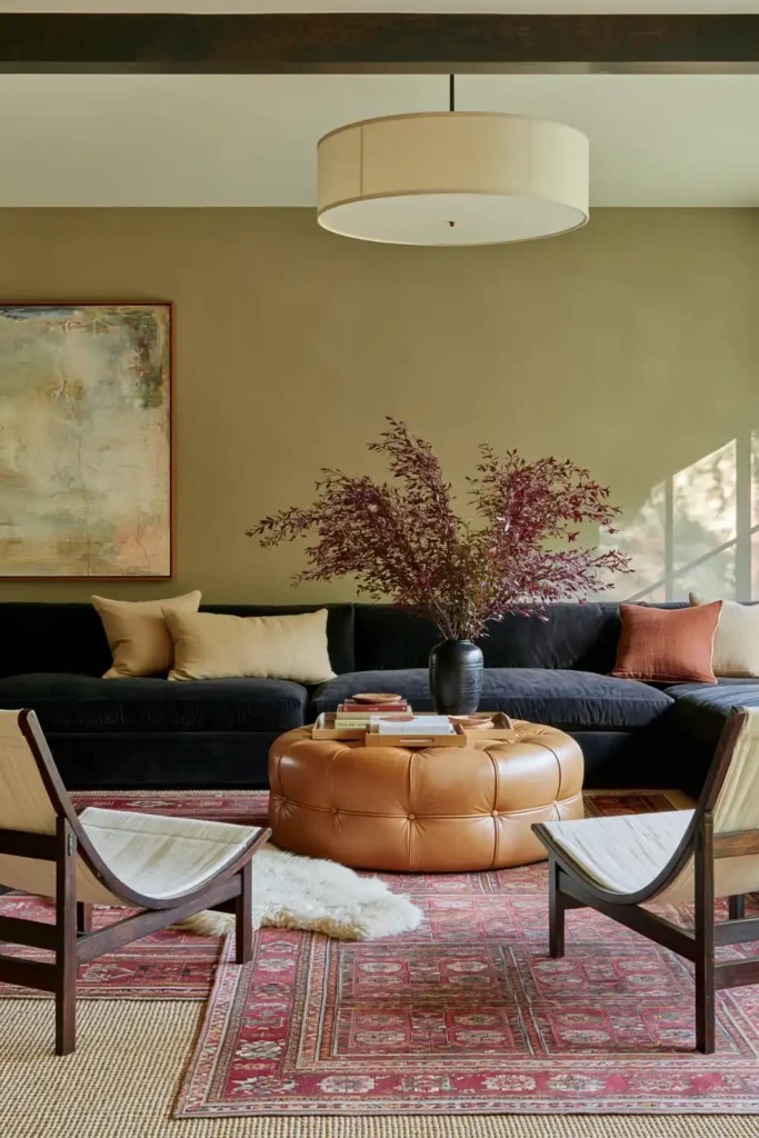
Creamy Off-White With Bright Coastal Blue Accents
A creamy off-white backdrop can give a traditional living room a fresh coastal feeling without making it look overly themed. The warm undertone keeps the walls soft, while white furniture helps the room feel open and light.
A bright blue sofa becomes the main source of color and gives the space a clear focal point. Smaller blue accents can be repeated through cushions, textiles, or decorative details so the scheme feels balanced rather than centered on a single piece.
Soft textures are important here because they keep the palette relaxed. Upholstery, layered fabrics, and comfortable finishes help the blue and off-white combination feel inviting instead of crisp or formal.
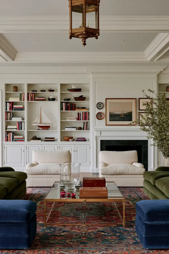
Moody Lilac, Mauve, and Aubergine With Warm Neutrals
Purple can create a luxurious living room when several softened shades are layered together. Lilac walls provide a lighter base, while mauve on the fireplace and deeper aubergine across larger surfaces offer depth and drama.
A pale purple sofa can sit comfortably within this palette without disappearing into it. Varied textures help separate the similar colors, allowing each shade to remain distinct even when they are used close together.
Softer brown accents and warm neutrals keep the scheme from feeling too cool. Under warm, gentle lighting, the purples become richer and more enveloping, which makes this combination especially effective in a room with traditional architectural details.
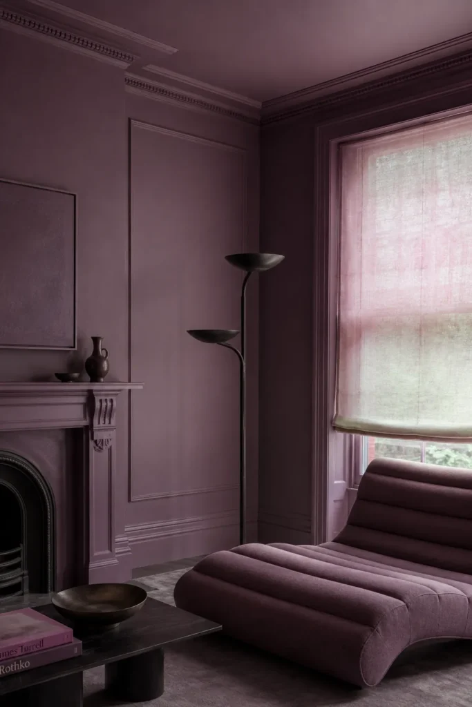
Gray-Green Walls With Terracotta and Warm Brown Accents
Earthy gray-green is a calm choice for a period living room or country-style snug. Its muted tone seems natural and settled, making it easy to pair with older architectural details and comfortable furnishings.
Warm brown and terracotta accents bring out the earthiness in the green. These shades can be introduced through upholstery, cushions, rugs, or smaller decorative pieces, adding coziness without overpowering the wall color.
For a more layered look, patterned wallpaper can be paired with gray-green trim. The same shade can also be extended across walls and woodwork for a color-drenched effect that feels unified and quietly dramatic.
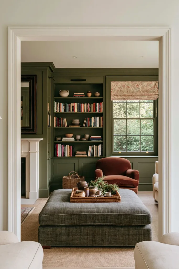
Vibrant Green Walls With Clashing Pink Furniture
Vibrant green walls paired with pink furniture create a lively living room designed for entertaining. A chartreuse sofa and a pink floral armchair introduce strong color from different directions, while the contrast gives the room an energetic, playful character.
Floral upholstery adds pattern as well as color, making the scheme feel collected instead of purely graphic. Neutral tones can be used around the brighter pieces to give the eye somewhere to rest.
Artwork and mirrors help break up large areas of green and add more visual tempo to the walls. This combination works best when the clash is treated confidently, allowing the pink and green to feel intentional instead of carefully matched.
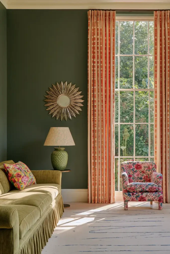
Light-Shifting Earthy Brown With Coordinating Woodwork
An earthy brown can make a historic or country living room feel especially warm when the shade changes gently throughout the day. In brighter light, the color may reveal softer undertones, while in the evening it becomes deeper and more cocooning.
Painting the woodwork in a coordinating brown creates a smooth transition between the walls, trim, and architectural details. The colors do not need to match exactly. A slightly lighter or darker shade can add definition while keeping the room visually calm.
Antiques, soft upholstery, rugs, and framed artwork suit this palette naturally. A view of green foliage outside can also provide a fresh contrast, helping the darker interior feel connected to the landscape rather than closed in.
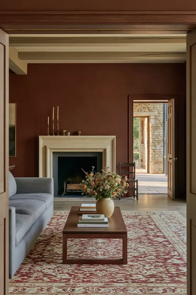
Bright Red and Powder Pink With Olive-Brown Trim
Red and pink can create a surprisingly balanced combination when an earthy trim color separates them. Bright red brings energy to a living room or game nook, while powder pink behind bookshelves softens the overall effect.
Olive-brown trim gives the two brighter shades a grounded edge. It can outline shelving, doors, or architectural details and stop the red and pink from flowing into one continuous field of color.
This palette works especially well with layered patterns, filled bookshelves, and a collected mix of decorative objects. The room will already have plenty of visual interest, so repeating the three main colors in small amounts can help everything remain connected.
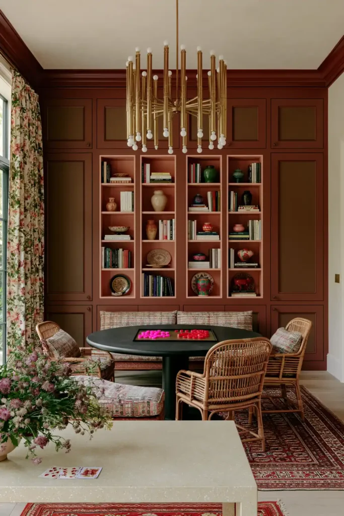
Mustard Yellow Walls With Subtle Red and Brown Accents
Mustard yellow brings warmth to a sitting room without the sharp brightness of a clearer lemon shade. A saturated yellow with brown undertones feels richer and more relaxed, making it a comfortable backdrop for a room used for reading or quiet conversation.
Relaxed upholstery and tactile fabrics suit the depth of the wall color. Mixing smooth, woven, and softly textured finishes keeps the room from feeling too uniform, even when the palette remains fairly restrained.
Small touches of red and brown can strengthen the heat already present in the mustard walls. These accents might appear through cushions, patterned textiles, or wooden furniture, giving the room a layered look without distracting from the main color.
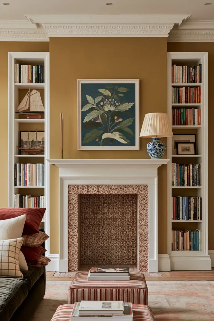
Mint Green Color-Drenching With Dusty Pink and Warm Umber
A celadon-leaning mint green can feel fresh and historic at the same time, especially when it is carried on the walls, ceiling, trim, and built-in features. The continuous color creates a calm envelope while allowing the shade to shift as the natural light changes.
Jade green armchairs deepen the palette, while rich brown or smoky ebonized wood adds contrast and age. An antique-style daybed covered in a Tree of Life print can introduce pattern without breaking the traditional character of the room.
Dusty pink and warm umber accents soften the cooler side of the mint. An accent rug can bring these tones together at floor level, helping the furniture, wood finishes, and painted surfaces feel part of one complete scheme.
Finding the Right Warm Palette for Your Living Room
The best living room color combinations for a warm feel are not limited to beige, cream, or brown. Soft pink, powder blue, sage green, mustard yellow, red, purple, and mint can all feel welcoming when they are paired with the right supporting tones and materials.
Start by looking at the light in your room and the colors already present in your furniture, flooring, and woodwork. A pale scheme may suit a bright space, whereas deeper shades can make a smaller or evening-focused room feel more intimate.
You do not need to use every color in equal amounts. Let one shade lead, then bring in the others through trim, upholstery, artwork, rugs, or smaller decorative details. That balance will help the room feel warm, personal, and comfortable in a way that suits your own home.