
Exterior paint choices feel more permanent than interior ones. While living room paint can be changed quickly, the home’s outside must coordinate with the roof, brick, trim, landscaping, and changing light.
Classic exterior color combinations create a finished look without being too trendy or loud. A balanced mix of siding, trim, doors, and accents enhances the exterior.
Now, let’s explore exterior color ideas suited for different home styles, ranging from soft neutrals to moodier shades and warm painted brick.
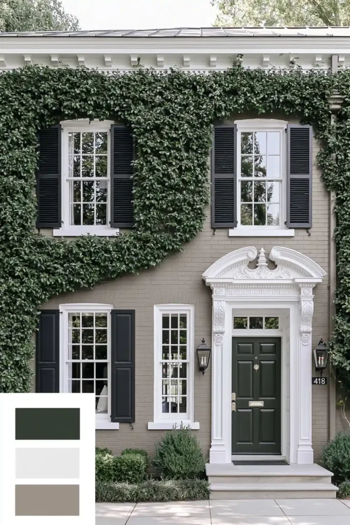
Soft Creamy Gray and Greige for a Classic Neutral Exterior
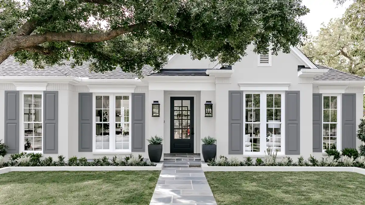
Soft creamy gray and greige sit quietly between warm and cool. Unlike stark white, they keep exteriors clean and calm. This palette helps a house feel classic without drawing too much attention.
Choose a shade with enough warmth to avoid a flat look. Creamy gray suits siding, while deeper greige defines trim, shutters, or porch details. These tones work well with natural materials like stone and landscaping.
Test color on multiple sides. Greige shifts in different light, so check morning and late afternoon shades to ensure consistency.
High Contrast Black Paint for a Dark and Moody Exterior
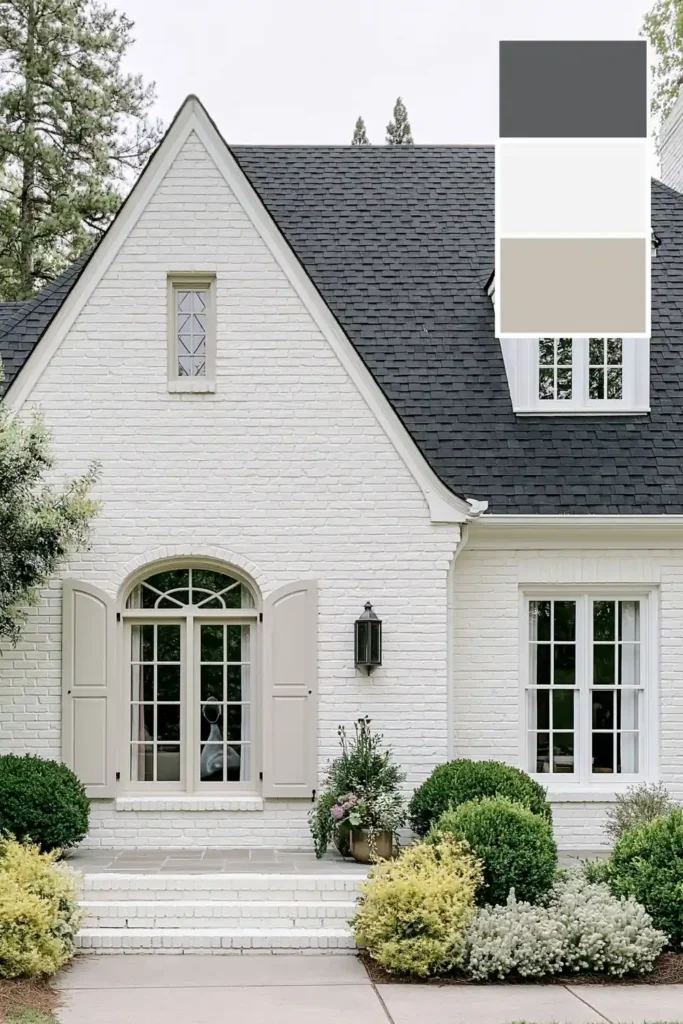
A dark exterior feels grounded with intentional black paint. It is bold yet classic when house lines remain simple, and details are clean. Black paint on carports or exterior structures creates contrast and defines architecture.
Black stands out best when balanced with textures or lighter nearby elements. Pale concrete, warm wood, brick, or greenery lighten the effect. Simple trim and accents keep the black the focal point.
Choose softer matte or low-sheen black for a natural look outside. Too much gloss highlights reflections. For homes with strong sun, test paint as light affects black’s appearance.
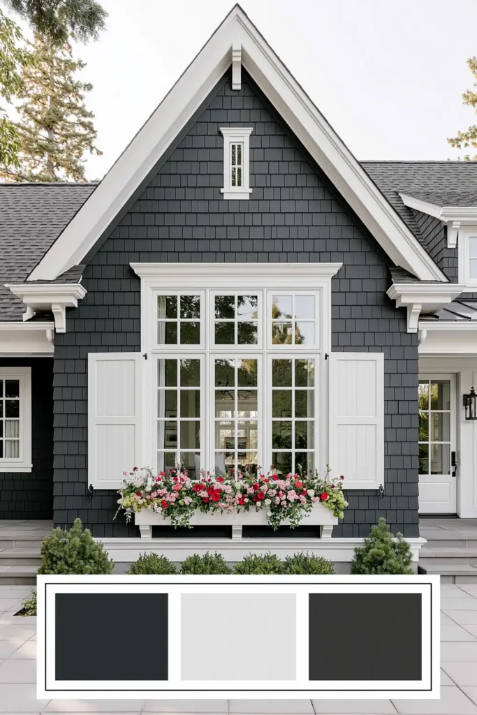
Desaturated Gray with Navy Undertones and Greenery
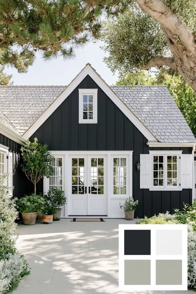
Desaturated gray with navy undertones adds depth without feeling too strong. It remains subtle, easy to pair with finishes, calm from the street, and shows personality up close.
This color works well with greenery. Shrubs, plants, grass, or foundation plantings naturally highlight the cooler paint and soften gray-blue, preventing a cold exterior.
Keep trim simple with soft or muted white framing windows and doors. Black fixtures or dark roofs offer contrast without extra color.
Terra Cotta Painted Brick with a Dark Front Door
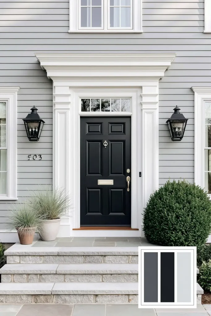
Terra cotta painted brick instantly brings warmth. It looks earthy and classic, rooted in clay tones, feeling welcoming without being overly bright or playful.
Pair terra cotta brick with hunter green or nearly black doors for a strong contrast and focus. Keep other details restrained so the brick remains front and center.
Avoid excess accent colors with this palette. Warm brick dominates, so simple trim, dark hardware, and understated planters keep the look intentional, not busy.
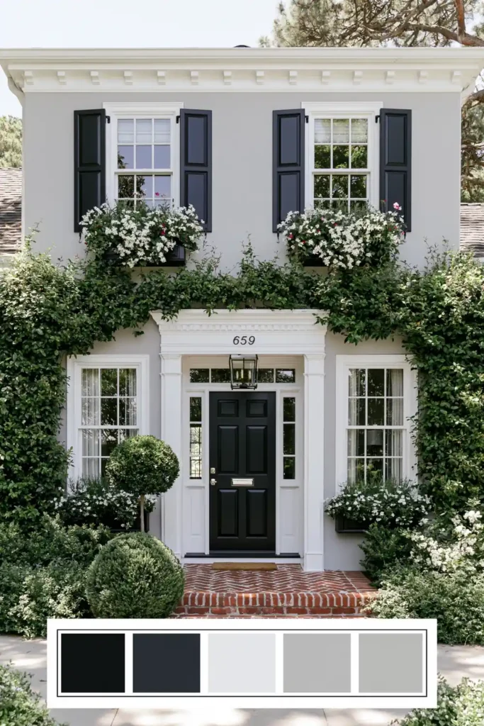
Black, White, and Gray with Flower-Filled Window Boxes
Black, white, and gray are some of the safest exterior colors to return to when you want a house to feel orderly and traditional. White keeps the main body fresh, gray can soften larger surfaces, and black gives doors, shutters, railings, or trim a clear outline. Together, they create contrast without needing a complicated palette.
Flower-filled window boxes and greenery soften the black-and-white contrast, adding warmth and life to straight lines or flat surfaces.
Use black only where it adds definition—shutters, front door, or window trim. Let window boxes provide seasonal color, allowing for easy updates without repainting.
Navy Blue Exterior Paint with Charcoal and Crisp White Contrast
Navy or blue feels classic when supported by light black or charcoal accents. Deep blue body brings character, while crisp white trim brightens the exterior.
Highlight architecture with white trim against navy siding. Use charcoal quietly on shutters, gutters, or accents for depth without harshness.
Check the roof color before choosing navy. Dark roofs suit softer blues, lighter roofs suit deeper navy. White keeps exteriors crisp either way.
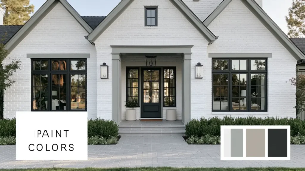
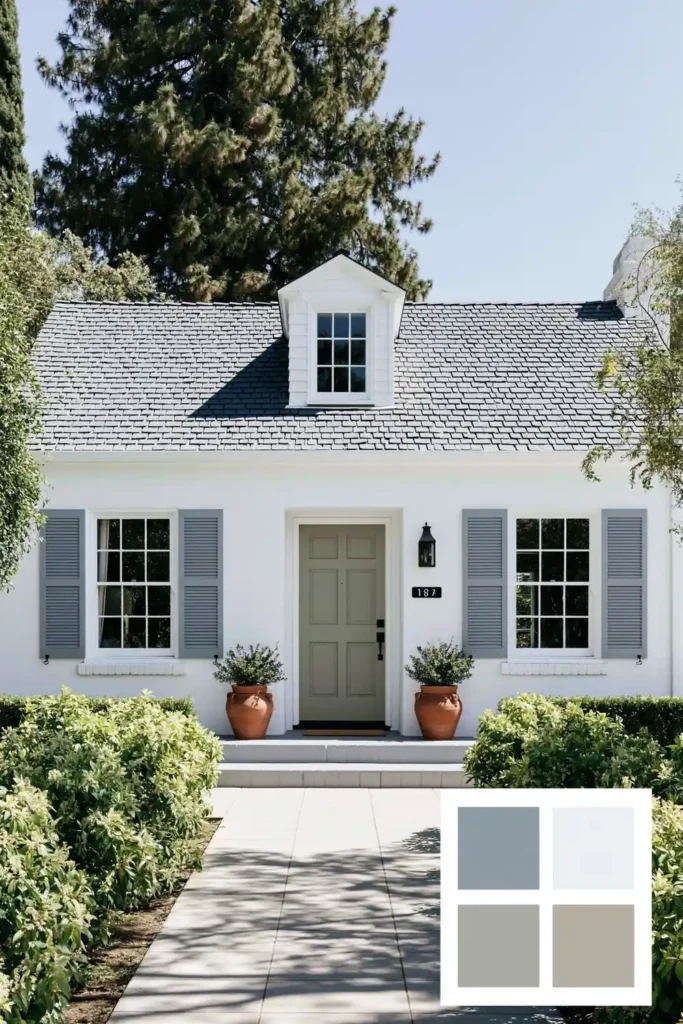
Soft Taupe Details with White Siding and Terra Cotta Planters
Soft taupe adds warmth without being too beige. Against white, taupe on gutters, trim, or features gives a gentle and calm contrast.
Pair taupe details with terra cotta planters and lush landscaping. White siding brightens, taupe softens, and planters connect house and garden. Greenery keeps colors natural.
Keep siding white; use taupe on trim and accent areas near the entry. Repeat warmth with terra cotta pots at the door or walkway.
Brick Exterior with Blue-Teal Paint and Black Accents
Brick brings texture, so paint needs to work with that. Blue-teal adds freshness and maturity without excess brightness.
Black accents on shutters, trim, railings, doors, or fixtures add structure and keep the palette firm. The result is a classic, personal feel.
Use muted blue-teal with brick—avoid saturated blues so material isn’t overpowered. Clean black details update the exterior, with brick staying important.
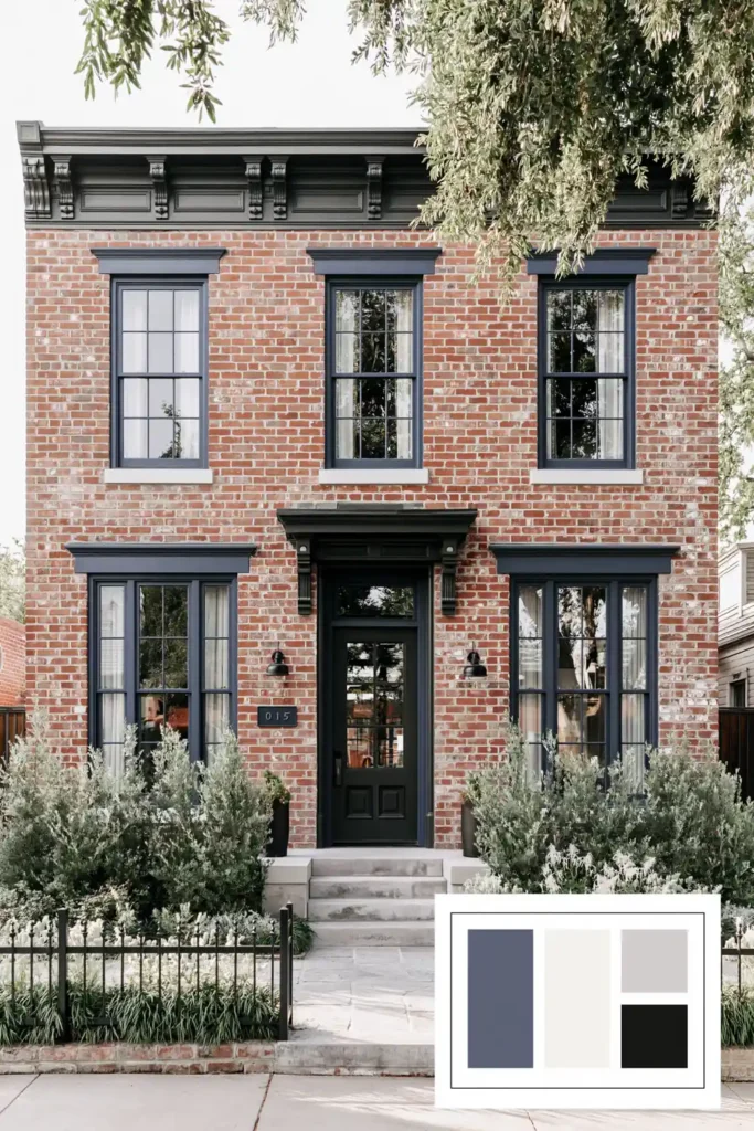
Classic Exterior Paint Color Blocking with Navy and Wood Accents
Color blocking works when following house architecture. Contrasting navy on the upper levels defines the shape without extra decoration.
Wood accents warm and add texture beside navy, especially around the entry, garage, porch, or siding. The mix feels classic, grounded by strong colors and familiar materials.
Make color breaks intentional by following clear lines—second stories, gables, or entry. Balanced navy, lighter color, and wood make the home appear planned, not busy.
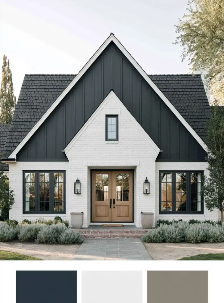
Bringing the Exterior Palette Together
The best classic exterior paint color combinations usually have a simple balance: one main color, one supporting contrast, and one material or detail that adds warmth. That might be greige with soft trim, terra cotta brick with a dark door, or navy paint with natural wood accents.
What I like about these ideas is that none of them depend on a passing trend. They work because they respect the shape of the house, the surrounding greenery, and the materials already there. Even small choices, like painting gutters taupe or adding flower-filled window boxes, can make the whole exterior feel more cared for.
Before committing, it is always worth testing paint samples outdoors and looking at them in morning light, afternoon sun, and shade. Exterior color changes more than people expect, and a little patience at the sample stage can help the finished home feel calm, balanced, and truly yours.