
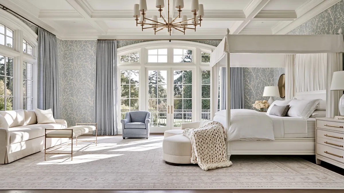
Decorating a home gets easier when you stop feeling like every choice has to fall completely into the “timeless” or “trendy” category. A good first step is to look around your space and identify which elements are permanent—such as floors, cabinetry, or main furniture—and which are more flexible, like accessories, artwork, or smaller decorative items. In my own home, I’ve found that the most comfortable rooms usually combine both. The permanent details stay calm and classic, while smaller pieces bring in personality and whatever feels fresh right now.
That balance is really what timeless vs. trendy home decor comes down to. You want a foundation you’ll still enjoy years from now, but you also want enough flexibility to keep your rooms from feeling frozen in time.
The ideas below show different ways to strike that balance, from architectural details and kitchen cabinetry to color, texture, and display pieces.
Neutral Living Room with a Classic Architectural Backdrop
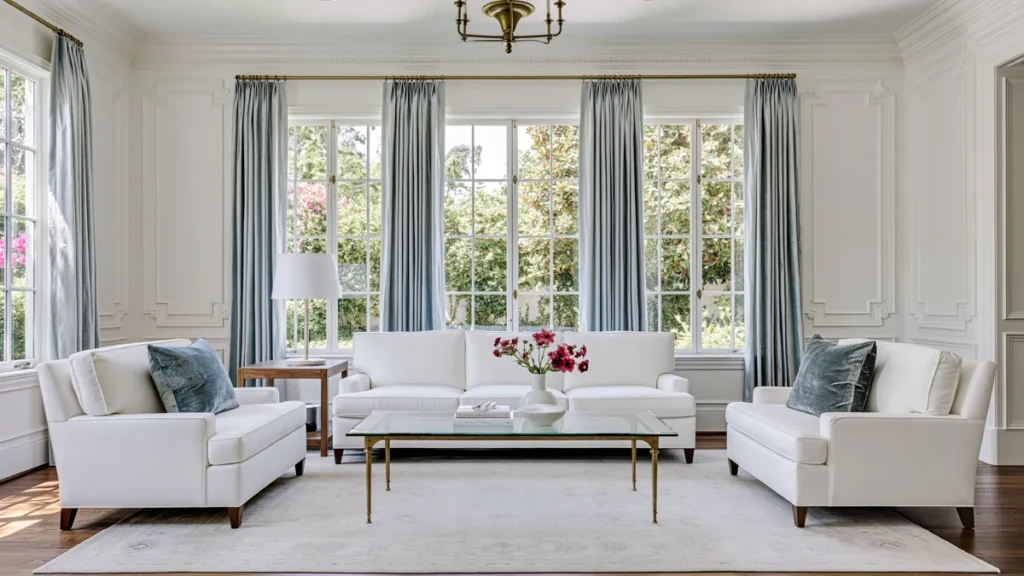
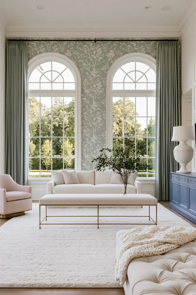
A neutral living room can feel anything but plain when the architecture is doing some of the visual work. Upholstered chairs and sofas in soft, restrained colors give the room a calm base, while elegant wallpaper, traditional trim, and other classic architectural details add depth behind them.
I like this approach because the larger furniture does not compete with the room. Instead, the backdrop becomes part of the decoration. Drapery also helps soften all those structured details, especially when the fabric has enough weight to create full folds around the windows.
This is the kind of room that can stay relevant for a long time because the expensive pieces are not tied to a short-lived color trend. If you ever want a fresher look, it is much easier to change pillows, small accessories, or artwork than to replace an entire sofa.
The key is keeping the neutral palette warm enough that the room still feels lived in. Cream, soft beige, warm gray, and muted taupe can all work well when they are layered rather than used as one flat color. For example, you might start with warm gray walls, then choose a sofa in soft beige and add textured pillows or throws in both cream and muted taupe. This kind of layering gives the room depth and interest while letting each shade stand out against the others, allowing the space to feel more inviting and intentional.
Glass Display Cabinets for Seasonal Decor and Collected Treasures
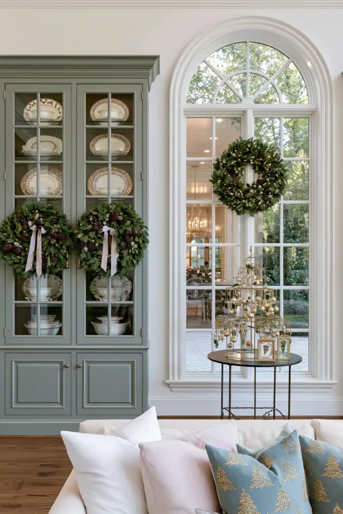
A glass display cabinet is one of those pieces that can feel classic while still giving you plenty of room to change the look of a space.
The wood frame gives it a furniture-like presence, while glass doors keep decorative pieces visible without leaving everything completely exposed. It works especially well in a living room or dining area where you may want to display favorite objects, seasonal accessories, or small collections.
What makes this idea useful is that the cabinet itself can stay the same while the contents evolve throughout the year. For example, in spring, you might fill the shelves with pale ceramic vases, glass bottles, or fresh floral arrangements. In summer, try displaying seashells, woven baskets, and vibrant art books. For fall, you could bring in vintage books, textured pottery, cozy candles, or small sculptural pumpkins. In winter, switch to metallic accents, evergreen sprigs in clear vases, or collections of white ceramics and simple pinecones. No matter the season, you can simply rotate items whenever the room starts to feel stale and give the display a new sense of life..
I would resist the urge to fill every shelf. Leaving a little empty space around objects makes the display easier to appreciate and keeps it from looking crowded.
This is also a practical way to enjoy trendier accessories without letting them take over the whole room. When a color or decorative style no longer appeals to you, you can swap out a few objects and keep the cabinet itself.
Classic White Shaker Cabinets for a Timeless Kitchen
White shaker cabinets have lasted through plenty of kitchen trends, and the reason is fairly simple: the design has enough detail to feel interesting without becoming visually busy.
The recessed center panel gives the doors a traditional profile, while the clean lines work comfortably in kitchens that lean classic, transitional, or even fairly modern. Painted white wood also creates a flexible background for countertops, hardware, lighting, and other finishes.
For anyone thinking about timeless vs. trendy home decor, cabinetry is one area where I usually prefer to be cautious with trends. Cabinets are expensive and disruptive to replace, so choosing a more enduring door style can make future updates much easier.
Hardware is where you can take a few more chances. Changing knobs and pulls later is far simpler than replacing cabinet fronts. A kitchen with white shaker cabinets can shift in character depending on whether the hardware is polished, dark, warm-toned, or more decorative.
White cabinetry also gives you freedom elsewhere. A bolder backsplash, colorful accessories, or distinctive pendant lights can stand out against it without making the entire kitchen feel overdesigned.
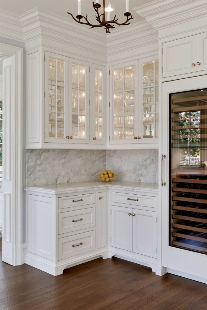
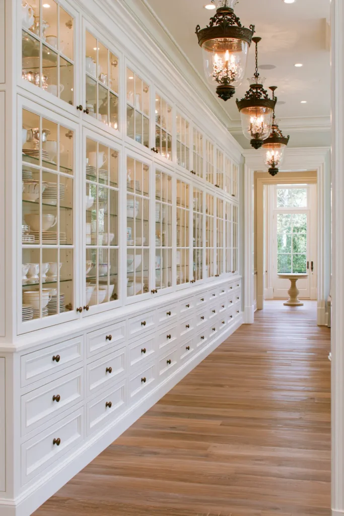
Clear Glass Cabinet Doors for an Open, Display-Ready Kitchen
Clear glass cabinet doors can break up a long run of solid upper cabinetry and make a kitchen feel more open without removing useful storage.
Because the contents remain visible, these cabinets naturally turn everyday pieces into part of the room’s decor. Glassware, dishes, serving pieces, or neatly arranged collections are all able to contribute color and shape to the kitchen.
I think this idea works best when it is used selectively. A few glass-front cabinets can create a focal point, while solid doors nearby keep less attractive necessities out of sight. That mix gives you the visual lightness of open storage without requiring every cabinet to look perfectly styled.
The cabinet hardware still matters because it frames the overall look. Traditional pulls can make clear glass doors feel more classic, while simpler hardware can push the same cabinetry in a cleaner direction.
If you like changing small details with the seasons, glass doors also give you an easy place to do it. A few displayed pieces can introduce a temporary color or style without changing the permanent parts of the kitchen.
The main thing to remember is that transparency brings responsibility. These cabinets look best when the contents feel intentional, so it helps to reserve them for the dishes and objects you genuinely enjoy seeing every day.
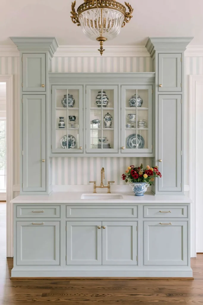
Blue Monochrome Cabinets with Matching Wallpaper and Trim
A monochrome room can feel bold without looking chaotic when the same color is repeated across cabinetry, wallpaper, and architectural trim. Blue works especially well for this because it can feel both traditional and current depending on the precise shade and finish.
Using one color in several places creates a wrapped, intentional effect. The painted cabinets establish the strongest block of color, while coordinating molding helps the room feel connected rather than pieced together. Wallpaper in the same color family can add pattern and dimension without introducing a completely separate palette.
This is a good example of where a trendier color choice can work with vintage elements. The cabinetry and trim still rely on familiar forms, but the full-room color treatment gives them a more contemporary personality.
If you are considering a stronger color like this, I would pay attention to undertones. Undertones are the subtle hints of color that show through the main shade—for example, a blue could have a bit of gray, green, or purple mixed in, which affects how it looks on your walls. A quick tip: hold a paint swatch next to something purely gray or white, and you will notice whether the blue leans warmer or cooler. A muted, slightly grayed blue regularly feels easier to live with than something very bright. Keeping the surrounding materials simple also gives the color space to be the main feature.
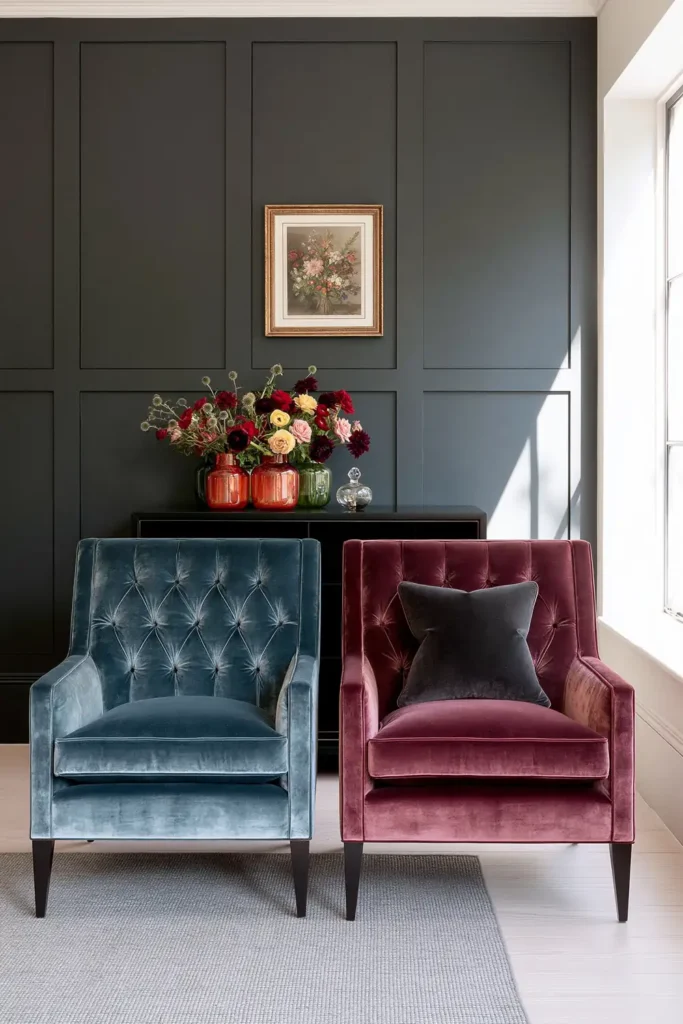
Velvet Accent Chairs in Blush and Navy
Velvet chairs are an easy way to introduce richer color and texture without committing an entire room to it. Blush brings softness and warmth, while navy feels deeper and more grounded.
Because an accent chair is a single piece, it gives you more freedom to choose something expressive. You can place one beside a neutral sofa, in a reading corner, or anywhere a room needs a stronger visual anchor.
Velvet itself adds another layer. Its surface catches light differently depending on the direction of the pile, so even a simple chair can have more depth than the same shape upholstered in a flatter fabric.
For a balanced timeless vs. trendy home decor approach, I like keeping the chair shape relatively versatile and letting the upholstery carry more of the personality. That makes the color feel deliberate instead of overwhelming.
If blush or navy eventually stops working for you, replacing or reupholstering one chair is much easier than changing the major furniture throughout the space.
Colorful Velvet Throw Pillows for an Easy Trendy Update
Throw pillows are one of the safest places to experiment with colors or textures you may not want to use permanently.
Blush and navy velvet pillows can bring the same richness as upholstered furniture, but in a much smaller dose. Quilted covers add even more texture and can help a sofa, chair, or bed feel layered rather than flat.
I especially like this idea in rooms with neutral upholstery. A few colorful pillows can completely shift the mood without competing with the larger pieces.
It also gives you freedom to change things gradually. You can introduce one or two pillows first, see how the colors feel in the room, and build from there instead of pledging to a full palette all at once.
This is one of the simplest ways to work with trends because the update is small, flexible, and easy to reverse.

Grasscloth Wallpaper for Natural Texture on the Walls
Grasscloth wallpaper adds interest in a quieter way than a bold printed pattern. Its appeal comes from the visible natural fibers and subtle variation across the surface.
That texture can make a living room, bedroom, or dining room feel warmer without relying on a lot of decorative objects. It works particularly well when the rest of the room has smoother materials because the contrast makes the walls feel more dimensional.
I also like grasscloth as a backdrop for classic furniture. The natural surface keeps traditional pieces from feeling excessively formal and gives newer pieces a little more depth.
Because the material itself already has movement and variation, it usually does not need much competition. Simple furnishings, restrained artwork, and natural finishes allow the wall covering to stand out without making the room busy.
Grasscloth can sit comfortably between timeless and trendy. Natural texture has lasting appeal, while the exact color you choose can make the room feel more current.
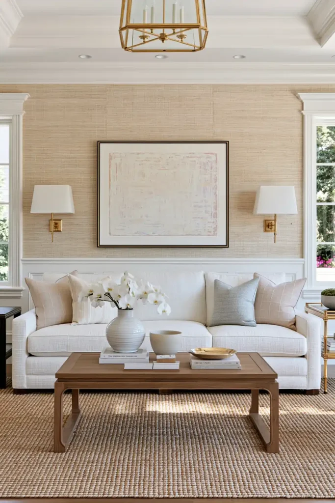
Kitchen Island Pendant Lights as a Stylish Focal Point
Pendant lights over a kitchen island do more than brighten a work surface. They also create a clear focal point and help define the island as the center of the room.
Metal and glass fixtures can work in a wide range of kitchens, which makes them a useful place to introduce a more current look without changing the cabinetry or countertops. The shape of the fixture, the finish, and the amount of visible glass can all shift the mood.
I tend to think of pendant lighting as one of the easier places to take a style risk. If the rest of the kitchen is fairly classic, a more distinctive fixture can bring character without affecting the permanent bones of the space.
Scale matters here. Pendants should feel substantial enough to relate to the size of the island, but they should not block sightlines or make the room feel crowded. Repeating the fixtures evenly also helps the arrangement look intentional.
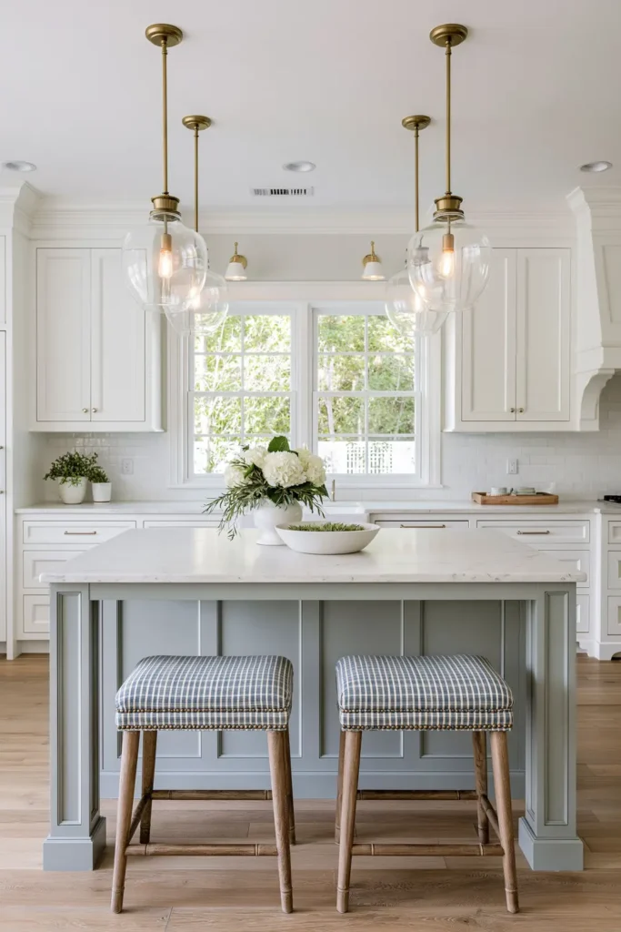
Sparkly Classic Chandeliers for Timeless Statement Lighting
A classic chandelier can bring elegance to a dining room or entryway without depending on a passing trend.
Crystal and metal create a combination that naturally reflects light and adds visual movement overhead. Even when the rest of the room is simple, a chandelier can give the space a more finished appearance.
What I like about this type of lighting is that it can act almost like architectural jewelry. It draws the look upward and gives the room a strong central feature.
In a dining room, the chandelier can help anchor the table visually. In an entryway, it can establish the atmosphere of the home as soon as you walk in.
If you are balancing timeless vs. trendy home decor, this is one of those pieces where a classic silhouette can be a smart long-term choice. You can always change surrounding colors, furniture, or accessories while letting the chandelier remain part of the room.
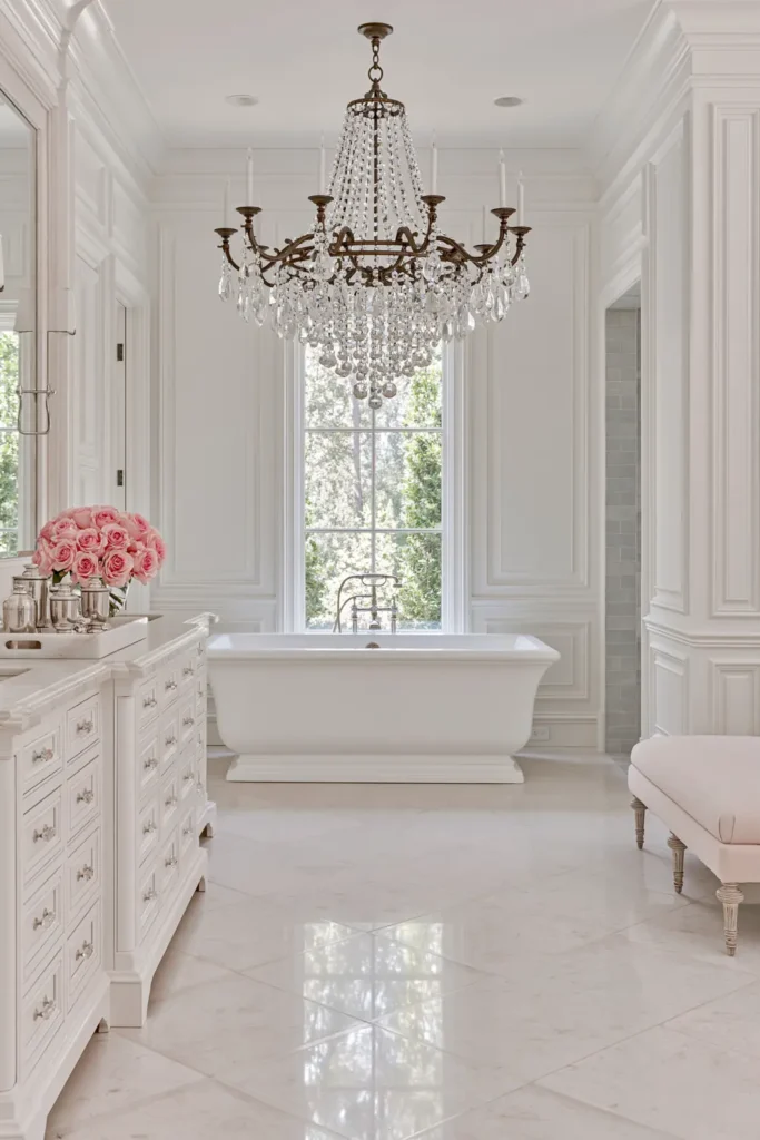
Trendy Accent Table Lamps for Smaller Style Updates
Table lamps are perfect for experimenting because they are relatively easy to move, replace, and restyle.
A lamp on a console, bedside table, or living room side table can introduce a new shape or finish without requiring a larger investment. That makes accent lighting a practical place to enjoy trends in smaller doses.
You can also use lamps to change how a room feels after dark. A pair of table lamps can create softer, more comfortable light than relying only on overhead fixtures.
I like keeping the surrounding furniture fairly versatile and letting the lamp bring in the more fun touch. This way, if your taste changes later, you are not rebuilding the whole room around one trend.
Even a small lamp can make a noticeable difference when the lamp’s silhouette contrasts with the table beneath it or when the shade adds another texture to the space.
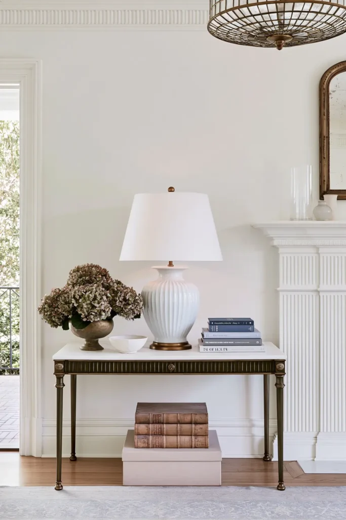
Large Statement Area Rugs to Anchor a Room
A properly sized area rug can make furniture feel connected instead of scattered around the room.
Large sizes such as 8×10, 9×12, or 10×14 can work especially well in living rooms, bedrooms, and dining spaces because they cover enough floor area to form a defined zone.
The woven textile surface also brings softness and texture, which helps balance harder materials like wood, stone, or metal.
One mistake I try to avoid is choosing a rug that is too small simply because the larger option feels like a bigger commitment. A small rug can make even good furniture look disconnected. A larger rug often makes the entire room feel more settled.
This is another useful area for mixing timeless and trendy choices. The scale of the rug can stay classic and appropriate for the room, while the pattern or color gives you room to express your current style.
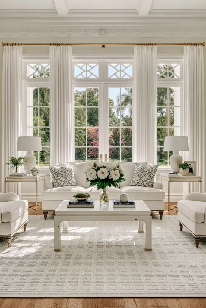
Black Contrast Shutters Against Painted White Brick
A white brick exterior with black shutters is a high-contrast combination that feels bright without depending too heavily on a trend. The painted brick creates a bright, simple background, while the darker shutters give the windows definition.
This kind of exterior works because the contrast is doing most of the decorating. You do not need a complicated color palette when the light brick and dark shutters already create a strong visual structure.
I also like how adaptable this combination can be. The black shutters can work with both traditional and updated exterior details, which gives you some flexibility when other parts of the house change over time.
If you are trying to make a home’s exterior feel more intentional, keeping the major colors limited can help. White brick and dark shutters create a clear foundation that allows landscaping, lighting, and other exterior details to stand out naturally.
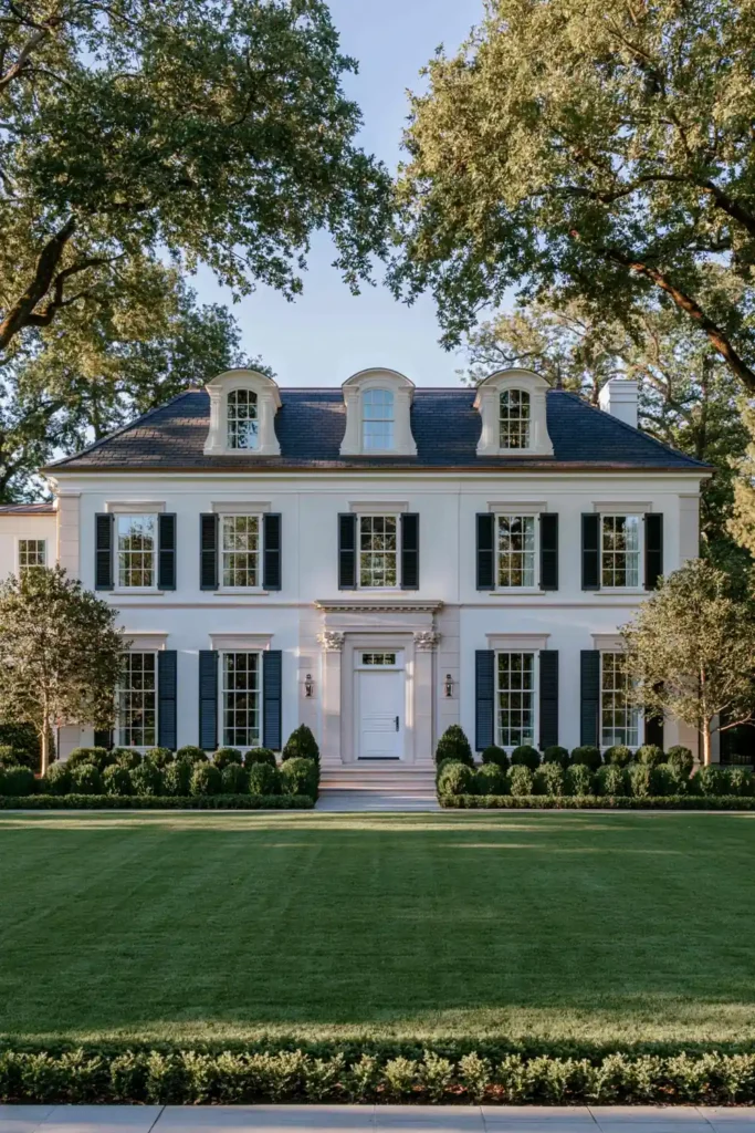
Timeless vs. Trendy Home Decor with Classic Wall Moldings
Classic wall moldings are one of the strongest ways to add character without filling a room with more furniture or accessories.
Painted wood moldings can give a living room, dining room, or foyer extra depth by creating architectural detail directly on the walls. White trim is especially versatile because it can work with many wall colors and decorating styles.
The beauty of molding is that it becomes part of the room rather than something placed inside it. That makes it a useful choice when you want your home to feel finished even before artwork and accessories are added.
To achieve a balanced timeless vs. trendy home decor approach, I would keep the molding profile fairly classic and use paint, wallpaper, or movable decor to introduce more current ideas.
This way, the architectural detail can remain while the room around it changes. A new wall color or different furniture arrangement can give the same molding a completely different feeling without removing it.
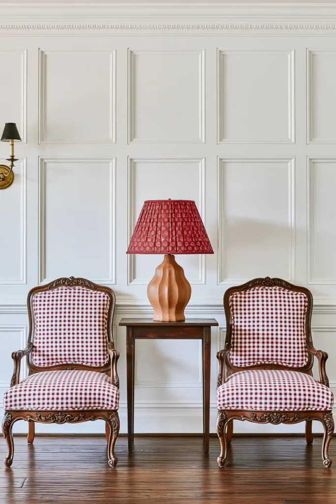
Gingham Upholstery on a Traditional Queen Anne Chair
A Queen Anne chair already has a recognizable traditional shape, but gingham upholstery gives it a more graphic and lively character.
The wood frame keeps the chair connected to classic furniture design, while the patterned fabric prevents it from feeling excessively formal. That contrast is what makes the combination interesting.
I like this kind of piece in a sitting area where one distinctive chair can carry more character without dominating the whole room. The gingham pattern gives the eye something to notice, while the familiar chair shape keeps the look grounded.
It is also a useful note that older furniture styles do not have to be decorated in an entirely traditional way. Upholstery can change how a recognizable silhouette feels.
If you want to experiment with pattern, a single chair is a manageable place to do it. You get the impact of a graphic fabric without recapitulating it across an entire sofa or room.
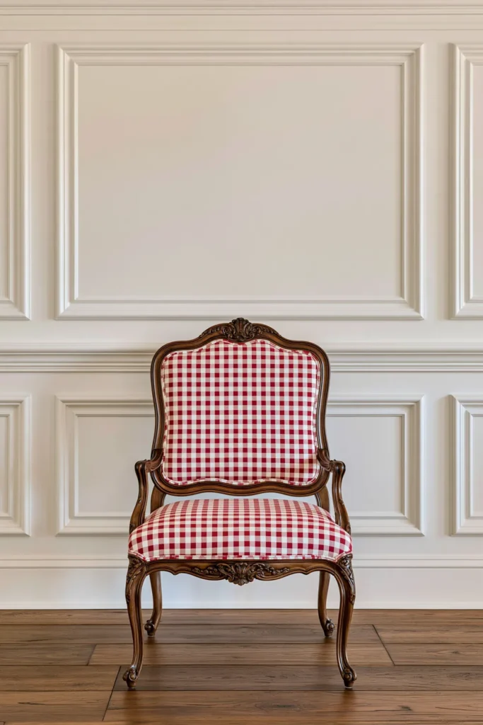
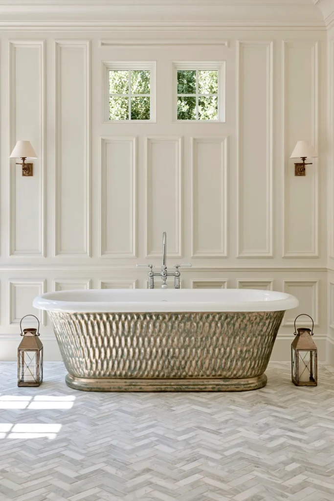
Floor-to-Ceiling Bathroom Wall Moldings for Classic Character
Bathrooms are often lined with hard, practical surfaces, so wall molding can bring in the kind of architectural detail that makes the room feel more considered.
Extending painted wood moldings from floor to ceiling creates strong vertical lines and gives plain walls more depth. Around a bathtub, that extra detail can turn a functional area into a more defined feature of the room.
Because molding does not require a bold color or pattern to be noticeable, it works well when you want character without making a bathroom visually busy.
I would keep the surrounding elements fairly restrained so the wall detail has room to show. A simple bathtub and a controlled palette can make the molding itself feel more important.
This is also the kind of update that can continue working through several decorating changes. Towels, mirrors, accessories, and paint colors may come and go, while the architectural framework can remain.
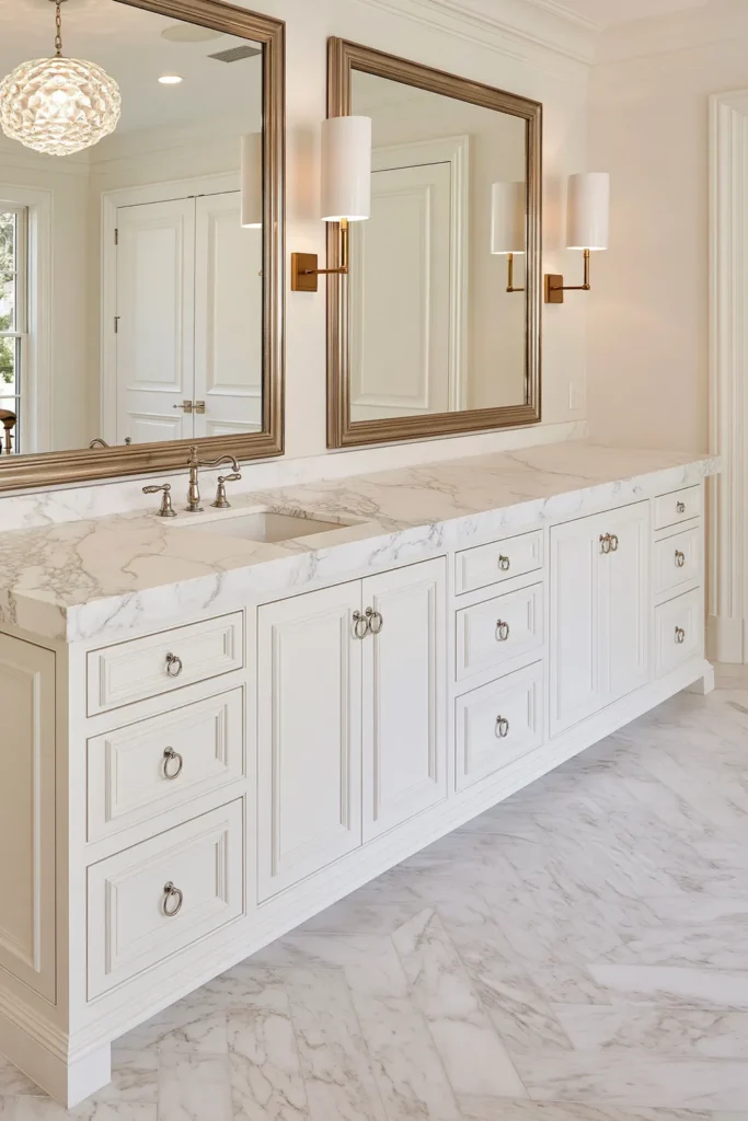
Neutral Marble Countertops for Kitchens and Bathrooms
Neutral marble is one of those materials that can feel refined without making a room look overly decorated. Its natural veining gives the surface variation, while the overall color stays easy to pair with different cabinetry, hardware, and wall finishes.
In kitchens, marble countertops can soften the look of painted cabinets and add a natural material to an otherwise polished space. In bathrooms, the same stone can bring a quiet sense of opulence without needing much additional decoration.
I believe this works especially well when you want the permanent finishes to feel timeless. Stone is a larger commitment than accessories, so a restrained marble color gives you more freedom to change the surrounding decor later. To keep marble looking its best, it is important to seal the surface regularly and clean up spills promptly with a gentle, pH-neutral cleaner. This helps protect the stone from staining and preserves its natural allure over time.
The veining already creates enough visual movement, so you do not have to force extra pattern into the room. Keeping nearby finishes simple lets the stone stand out naturally.
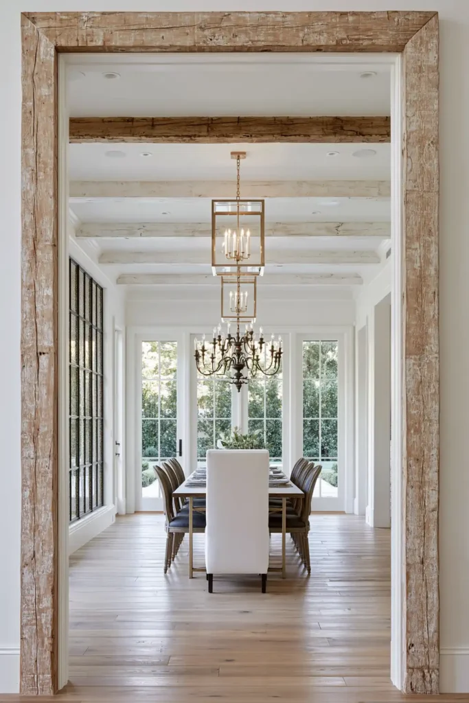
Natural Linen, Wood, Stone, and Leather Accent Elements
Natural materials are an easy way to make a room feel warmer and more layered without relying on bold color.
Linen adds softness, wood brings visible grain, stone gives weight and variation, and leather delivers a richer surface that may develop more character over time. Using several of these materials together creates contrast even when the palette continues neutral.
This is useful in rooms that are starting to feel too flat or excessively polished. Instead of adding more decorative objects, you can add texture through the materials themselves.
For me, that is one reason these items work so well in a timeless vs. trendy home decor mix. The materials have lasting appeal, while the exact shapes and pieces you choose can still reflect what feels current.
You do not need to use every material at once. Even a linen accent paired with a wooden piece and one stone element can give a room more depth.
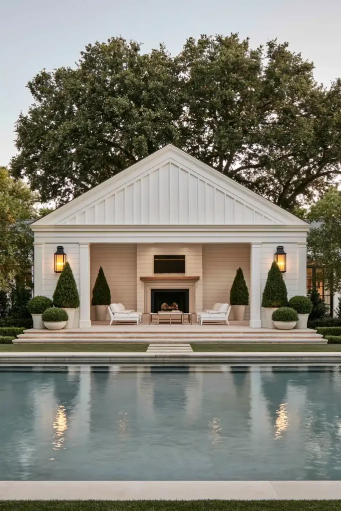
Symmetrical Pools with Classic Brick Pool Houses
A rectangular pool paired with a brick pool house creates a strong sense of order in an outdoor space. The clean geometry of the water and the structured architecture work together to make the backyard feel intentional.
Symmetry plays an important role here. When the pool and surrounding features are balanced, the outdoor area can feel calm even before furniture or accessories are added.
Brick gives the pool house a classic material that can age gracefully, while traditional outdoor lighting can support that more established look after sunset.
I like this idea because the permanent elements do most of the work. The pool shape, brick structure, and overall layout create the foundation, while smaller outdoor pieces can change over time.
That makes it easier to refresh the space with different furniture or accessories without losing the character of the backyard.
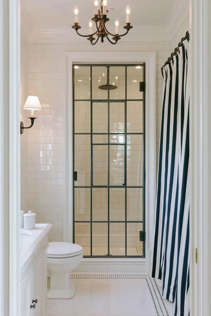
Black and White Pool House Bathrooms with Subway Tile and Sconces
A black and white bathroom is simple enough to feel lasting, but strong enough to have personality.
Subway tile provides a familiar surface, while dark and light finishes create clear contrast around the room. A wall mirror and sconces can add symmetry and help the space feel finished without introducing too many competing details.
This combination works particularly well in a pool house bathroom because it feels clean and simple. The limited palette also makes it easier to replace smaller accessories without having to rethink the entire room.
Ceiling trim can add another traditional layer and keep the bathroom from feeling too plain. When architectural details, tile, and lighting are all working together, even a compact space can feel carefully designed.
For a timeless foundation, I would keep the main black and white elements simple. Any trendier touches can come through smaller pieces that are easier to update later.
Achieving the Right Balance for Your Home
The best rooms rarely feel completely timeless or completely trendy. What makes them interesting is the mix: dependable materials and architectural details forming the foundation, with more flexible colors, patterns, lighting, and accessories adding personality.
I like to think about permanence before making a decorating decision. Cabinets, countertops, molding, and major furniture usually deserve choices you can imagine living with for years. Pillows, lamps, upholstery accents, and decorative displays give you much more freedom to experiment. If you are not sure where to start, try making smaller, reversible changes first before committing to bigger updates. Swapping out accessories or adding a new pillow is a low-risk way to see what feels right for your space, and these little shifts can help you build confidence before you invest in more permanent elements.
You also do not need to bring every current idea into your home. Choose the ones that really suit your rooms and the way you live. A blush velvet chair may feel perfect in one home, while another might get its personality from blue cabinetry, grasscloth walls, or a striking chandelier.
When timeless and trendy elements are chosen thoughtfully, your home can feel current without constantly needing to be redone. Start with the pieces you want to keep, then layer in the details that make the space feel like yours.