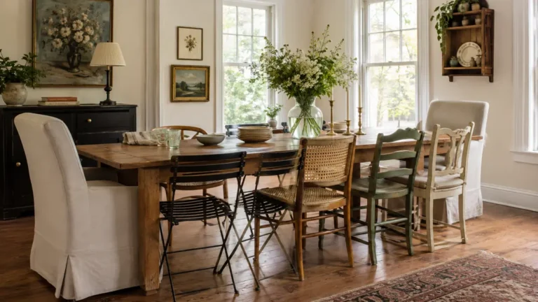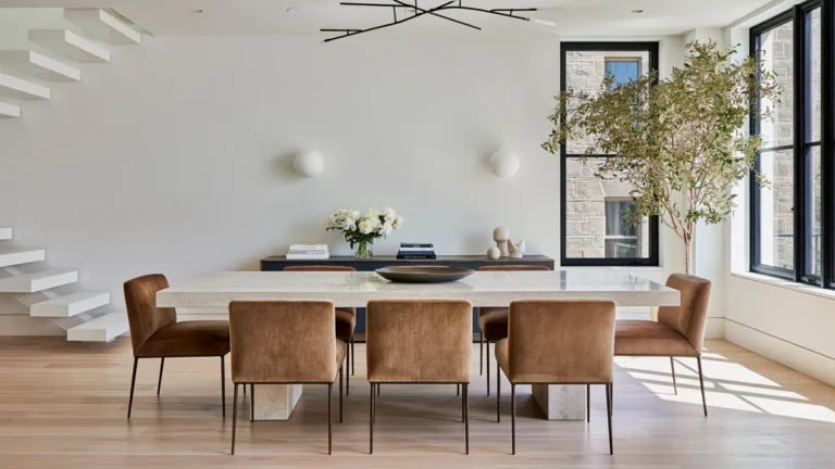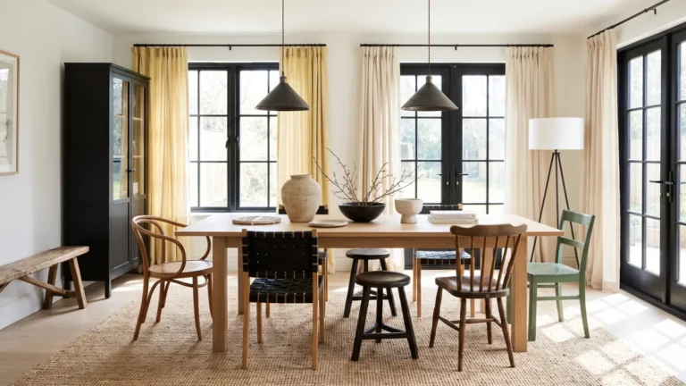

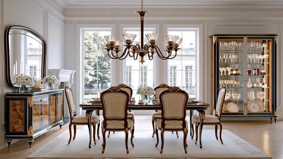
Choosing the right colours can completely change how a dining room feels. The best dining room colour ideas do more than decorate the walls—they help create a space that feels comfortable, welcoming, and suited to the way you use it.
Whether you prefer soft neutrals, deep dramatic shades, or a polished combination of colour and metallic details, these four ideas offer practical ways to build a dining room with personality.
Warm Beige Dining Rooms with White Details and Decorative Stucco
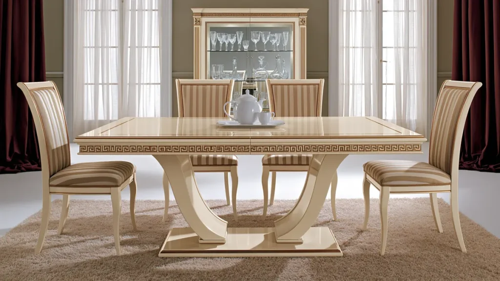
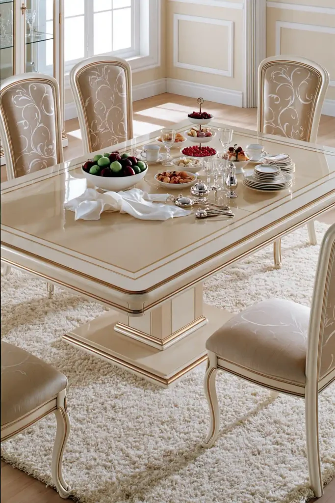
Beige is a dependable choice when you want the dining room to feel calm, bright, and easy to live with. It creates a warm neutral background that works especially well in rooms where the table, chairs, sideboard, and display cabinets already add plenty of visual weight.
To keep beige from looking flat, add texture through wallpaper or a stucco wall finish. A subtle wallpaper pattern can give the room more dimension without overpowering the furniture, while decorative stucco adds an elegant architectural detail.
White accents help sharpen the overall look. White trim, moulding, or decorative wall details can break up the beige and prevent the room from feeling too muted. This combination works particularly well in dining rooms where you want a classic appearance that still feels light and relaxed.
The result is a flexible space that can easily be updated over time. Different table linens, artwork, or chair fabrics can be added without needing to change the main colour scheme.
Sophisticated Grey Dining Rooms with Upholstered Chairs and Patterned Wallpaper
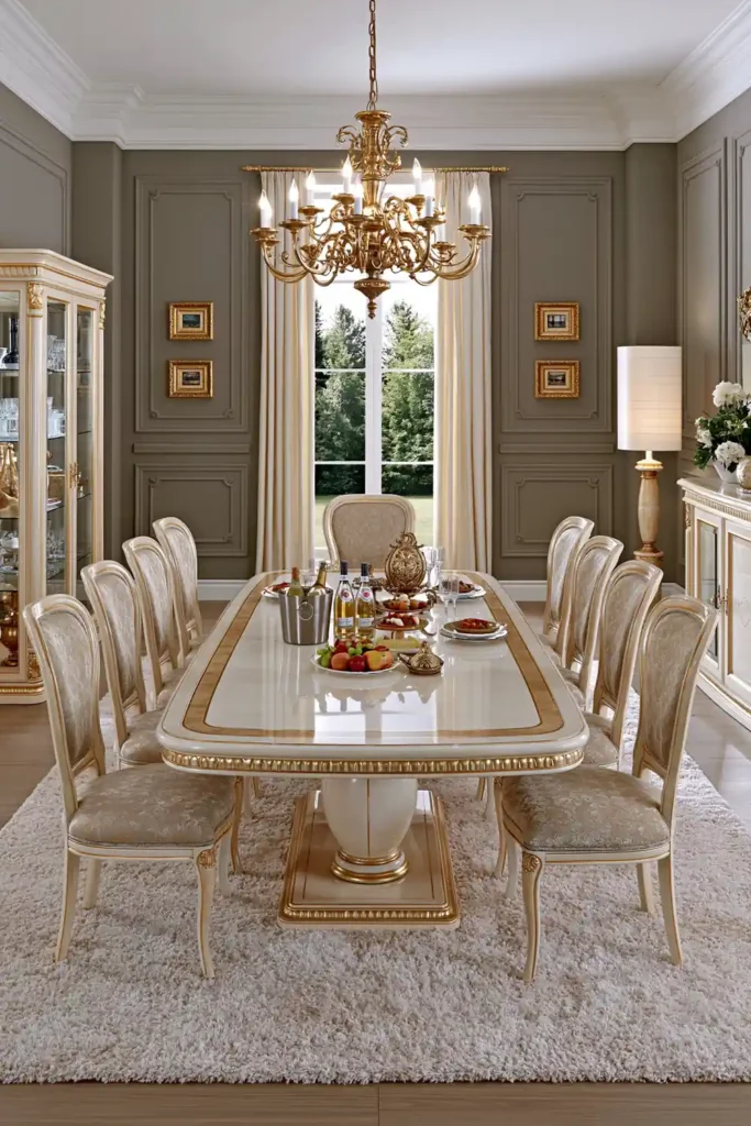
Grey gives a dining room a refined and balanced appearance. It can suit both modern and traditional furniture, which makes it a sensible choice when your dining set includes a mixture of styles.
An efficient way to use grey is through upholstered dining chairs. Grey fabric can soften the lines of the furniture and make the seating area feel more comfortable. A medium or deep grey upholstery also hides everyday wear better than very pale fabrics.
Grey wallpaper can add another layer of interest. Choose a pattern that is noticeable up close but subtle enough to let the table and chairs stay the focus of the room. In a smaller dining room, a lighter grey can help the walls feel open, while a darker shade may create a more intimate atmosphere.
Because grey is unbiased, it also allows the shapes and finishes of your furniture to stand out. Modern chairs can look cleaner and more sculptural, while classic pieces gain a quiet sense of grace.
Dark Green Dining Room Colour Ideas with Matching Curtains and Mirrors
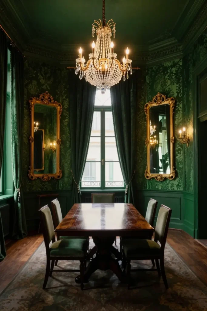
Dark green is one of the most striking dining room colour ideas for forming a rich, warm atmosphere. It gives depth to the room and works especially well in spaces used for evening meals or relaxed gatherings.
Green wallpaper can provide the main backdrop, while coordinating curtains help carry the colour across the room. Employing similar shades in both places creates a coordinated look without requiring every element to match exactly.
Mirrors are especially useful in a dark green dining room. They reflect light around the space and help prevent the deeper colour from making the room feel closed in. Positioning a mirror near natural light or opposite a light source can make the walls feel more luminous.
Small light spots can also highlight the wallpaper, mirrors, or decorative details. This creates pockets of brightness and gives the room a layered, atmospheric feel rather than relying on one strong central light.
To keep the scheme balanced, repeat the green in a few smaller decorative elements. This may include table accessories, artwork, or details on a sideboard, helping the colour feel deliberate throughout the room.
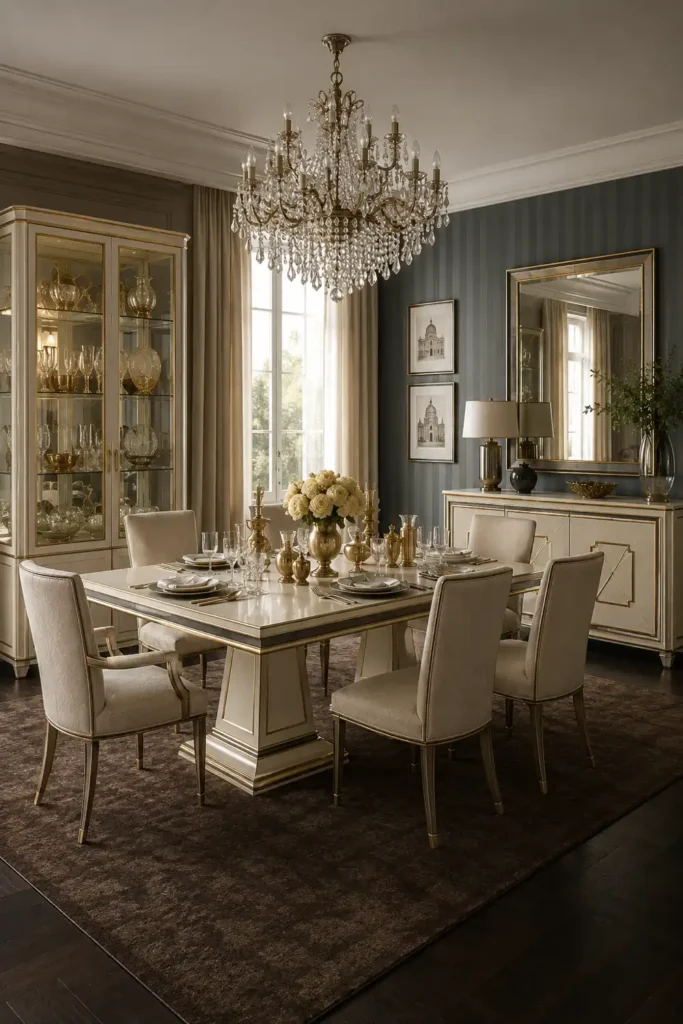
Dark Blue and Gold Dining Rooms with Coordinated Upholstery and Metallic Finishes
Dark blue and gold create a dining room that feels dramatic and polished. The deep blue provides a strong foundation, while the gold adds warmth and catches the light.
Blue curtains with gold patterns can become a major feature in the room. They frame the windows while connecting the two main colours in a natural way. Coordinating the curtain fabric with the chair upholstery helps the room feel carefully planned rather than overly decorated.
Gold finishes can be introduced through furniture details, such as legs, handles, frames, or decorative edges. These touches do not need to be large. A small amount of gold is often enough to bring contrast and elegance to the darker blue.
The chair upholstery can repeat the blue, gold, or a combination of both. Keeping the fabric connected to the curtain pattern helps create a consistent flow around the dining area.
This colour combination works best when the gold is used selectively. Too many metallic surfaces can make the room feel busy, but a few well-placed details will stand out beautifully against the dark blue background.
Choose the Colour Mood That Fits Your Home
Each of these colour schemes creates a different dining experience. Beige feels warm and flexible, grey brings calm sophistication, dark green creates depth, and dark blue with gold delivers a more dramatic finish.
The best choice depends on the mood you want to create and the furniture already in the room. Start with the main wall or fabric colour, then repeat it via curtains, upholstery, wallpaper, or decorative details.
A dining room does not need many colours to feel complete. A thoughtful palette, supported by texture and coordinated finishes, can make the space feel comfortable, distinctive, and ready for everyday meals or special gatherings.